Design Hacks: How To Make Your Space Feel Larger
“This storm is making me tired”, said the boy, “storms get tired too”, said the horse
A little something we read that keeps us going. As we put pen to paper for this blog post, we really hope everyone is staying safe. It’s been a tough couple of months.
Our homes now seem to be the protagonist of this particular moment we are living in. Needless to say this is going to change the way we live in our homes and also the way we design them. Since we’re all cooped up more than ever before, the need to enhance the spaces we inhabit arises. We’ve put together a few effortless design hacks that will make your space feel a lot larger than it really is!
Include mirrors & reflective surfaces
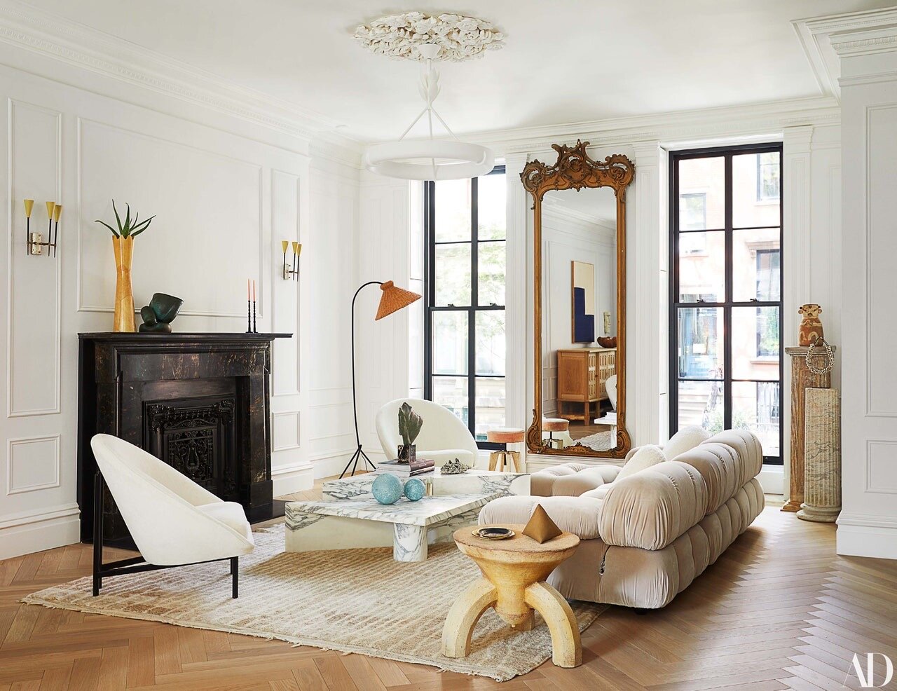
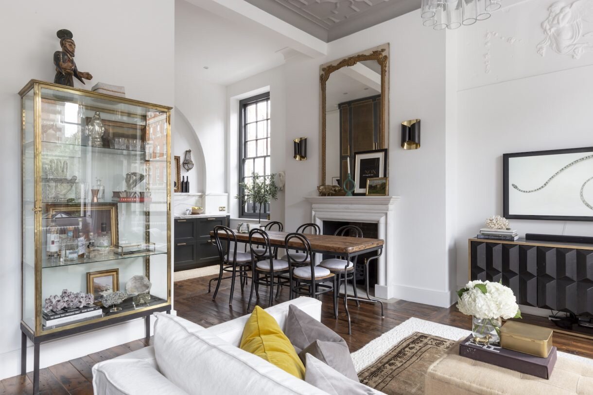
Surely, this is not the first time you’re reading this - the concept of staging mirrors to make a space larger than it really is, is quite self-explanatory. Place your mirror in such a way that it reflects the maximum amount of natural light - ideally right opposite a window and if it’s sporting a good view, then it’s an additional bonus! Other reflective surfaces woven into the material palette have this notional illusion as well.
Image Credit: Livingetc
Pick neutral tones
Lighten the colour palette of your space. Muted tones for your walls will definitely do the trick! If you want to let your walls scream louder hues, switch up your furniture and soft furnishings to an incarnation of softer, more natural inspired tones.
Image Credit: Livingetc
Incorporate large artwork or artefacts
Yes, for all the art collectors out there, sizeable pieces of art placed on smaller walls will definitely enhance the size of a space. The smaller pieces of art, can be placed slightly above eye level to provide an illusion of taller walls. But, if you’re one of those who likes to intertwine a lot of art through your spaces, scatter it through the house instead of perching it all up on one wall - it will open up the space and keep it more fresh, light and interesting.
Image Credit: Architectural Digest
Embrace statement pieces
One often thinks that a smaller space would require smaller pieces of furniture, however, large statement ensembles, add more character. Use fewer pieces but the right ones to create an impact!
Image Credit: Vogue
Pull furniture away from the wall
Particularly for smaller pieces of furniture, pull them away from the edge of the wall. This makes the space feel more intimate and less heavy. The furniture pieces sit in better accord with one another, which creates a sense of balance resulting in the right conversation between them.
Image Credit: Vogue
Utilise furniture with legs
Lighter silhouettes open up a space. Hence, selecting furniture pieces with legs creates a feeling of more room as more floor area is visible. However, complimenting this with pieces that have a solid base results in just the right equilibrium.
Image Credit: Livingetc
Go light on your shelves
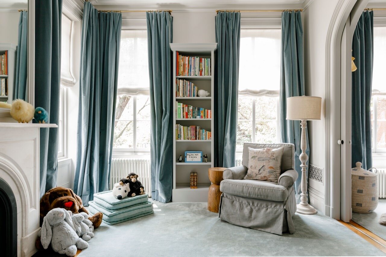
When it comes to shelving, choose floating ones instead of heavy book cases, as they make the space feel lighter and more spacious. However, if you do decide to go with the latter then keep the edges slim!
Image Credit: Unknown
Layer your lighting
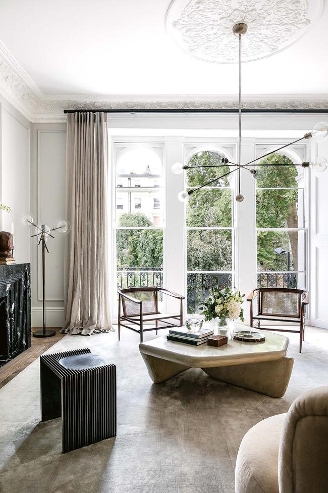
Let as much natural light surge through and envelope your space, so it is rendered bright and fresh! Alongside this, the lighting scheme should be in layers and at different levels - on the ceiling, floor and tables. Chandeliers on the ceiling provides the illusion of a taller ceiling - so go ahead and get those statement pieces.
Image Credit: Vogue
Curtains or blinds?
If you’ve got to pick between curtains and blinds, considering the context of this post - blinds it is, as they reduce the heaviness of a space. If you have chosen the former though, then ensure they touch the floor as it makes the height feel taller.
Image Credit: Architectural Digest
Make use of glass
Glass has been used extensively in interior design, for obvious reasons. We all know glass allows for more light to come through and allows for more visual transparency between spaces, making it seem like one space is an extension of the other.
Image Credit: Livingetc
We hope this helps enhance your home and thereby enrich the experience of inhabiting in it. Before we bid our readers adieu, we’ve got to mention a few websites that we have referred to, and echoed with whilst writing this blog post.
https://www.architecturaldigest.com/story/8-clever-ways-maximize-small-space
https://www.architecturaldigest.com/story/decorating-small-spaces
https://studio-mcgee.com/5-ways-to-make-a-room-look-bigger/
https://www.alicelaneinteriordesign.com/blog/how-to-do-big-design-in-a-small-space
Until next time - Stay safe!


