Sriracha: A hot & spicy evolution!
The day has finally come! We are very excited to launch Sriracha to the world. It was a fun but gruelling adventure that involved crashing tons of food tastings that we definitely did not need to attend (such a hard life!). We thought we’d break it down for you, show you our process, our inspiration and before/after shots!
You guys might recognise Sriracha- formerly Singkong - a local favourite. The space already had an asian vibe but we wanted to give it an upgrade with minimal intervention ie. keep structure, flooring and ceiling as is.
We didn’t want to go the traditional route when designing Sriracha, we’ve worked closely with the branding team (our design bff and neighbour A&J Design Works to make sure the design is unique and cohesive. The rest of the team included our long term collaborator Woodlabs who turned technical nightmares into sweet sweet realities and last but not least Krackn who are just badass and awesome and we love them. Together, inspired by contemporary asian design, we’ve used traditional materials and colours in a unique way that is minimal yet fun, perfect for a night out!
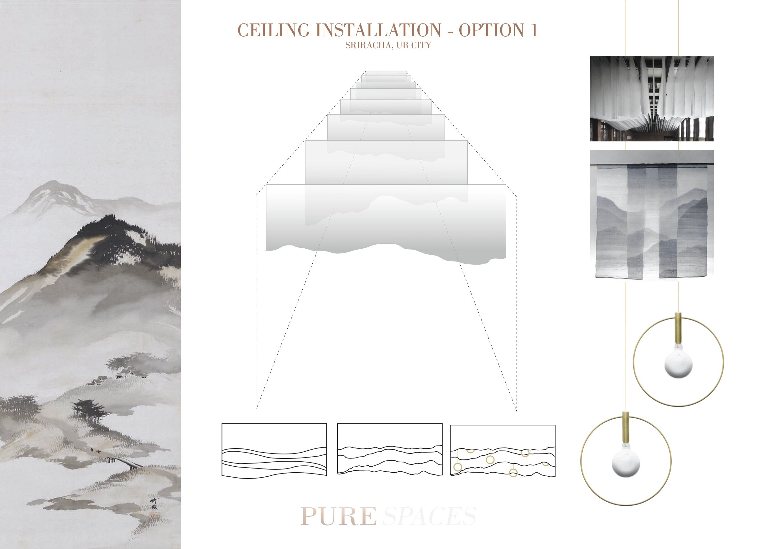
You can see some of our initial ideas in the mood board below which evolved over time thanks to a nudge on our clients end to make the design more “urban”. If there was ever a project to show off our street cred, this would be it.
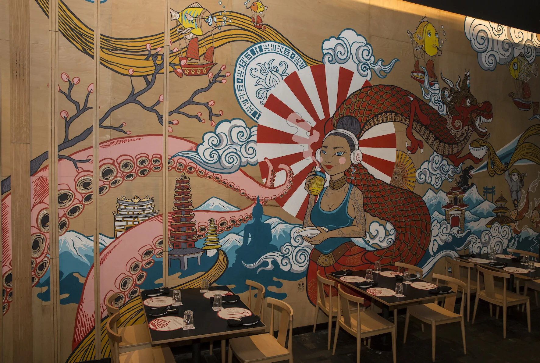
We initially wanted to do an installation on the ceiling and after maybe going through over 10 different ideas we decided to drop it in favour of our much beloved mural.
The whole project was about logistics, the client didn't want to close the restaurant down so we had to have each element designed in such a way that it would be made outside and assembled within a week on site. Since we were on a time crunch, we built the wall cladding over the existing cladding (so much easier than ripping it off) and had the wood cut into different sized panels (so the joints wouldn't be obvious).
Krackn to carry the heavy mismatched panels three at a time to their studio and paint the expansive mural panel by panel jigsaw style before putting it together on site. Troopers right? A second layer of wood in the form of long slats were added to bring out texture and warmth that would break away to reveal the mural.
The eight countries that Sriracha represents in its branding are subtly used in the interiors to differentiate itself from Sanchez. The mural is heavily inspired by this, besides our badass heroine, crazy tentacles and flying fish we we challenge you to find all representations from all 8!
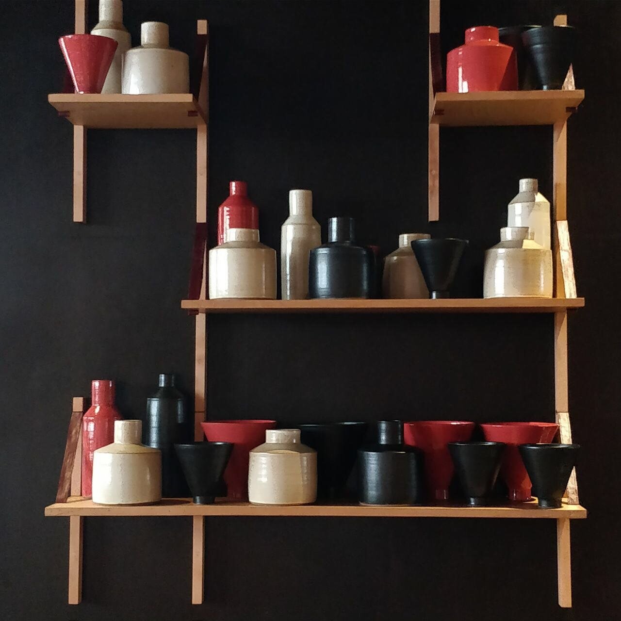
The service table were made from scratch and the dining tables were made using ash wood that was then charred using a blow torch. The chairs were carefully selected and shipped from Indonesia. Cermaics came from Pondicherry (best work trip!) custom made to fit in with the asian style and colour palette of the restaurant. Traditional earthenware accessories coloured in a deep red hue from the logo brings a pop of colour into our contemporary asian pine wood shelves.


