PS Picks at Salone del Mobile ‘22
A delightful week and behind every designer’s dream lies the Salone del Mobile that happens in Milan every year bringing in together some of the world’s finest creators in the field of furniture, lighting, kitchens and so on.
A delightful week and behind every designer’s dream lies the Salone del Mobile that happens in Milan every year bringing in together some of the world’s finest creators in the field of furniture, lighting, kitchens and so on.
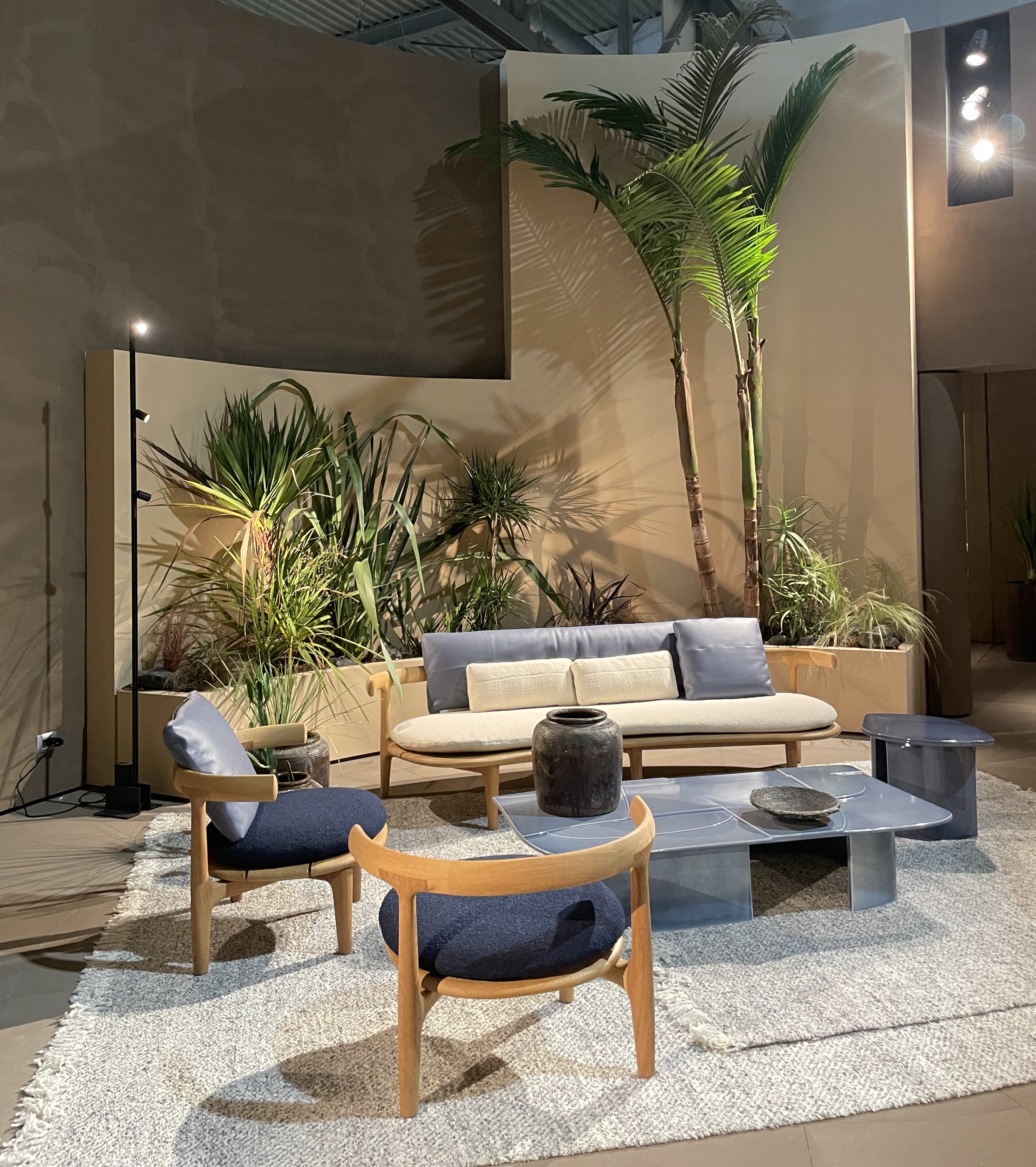
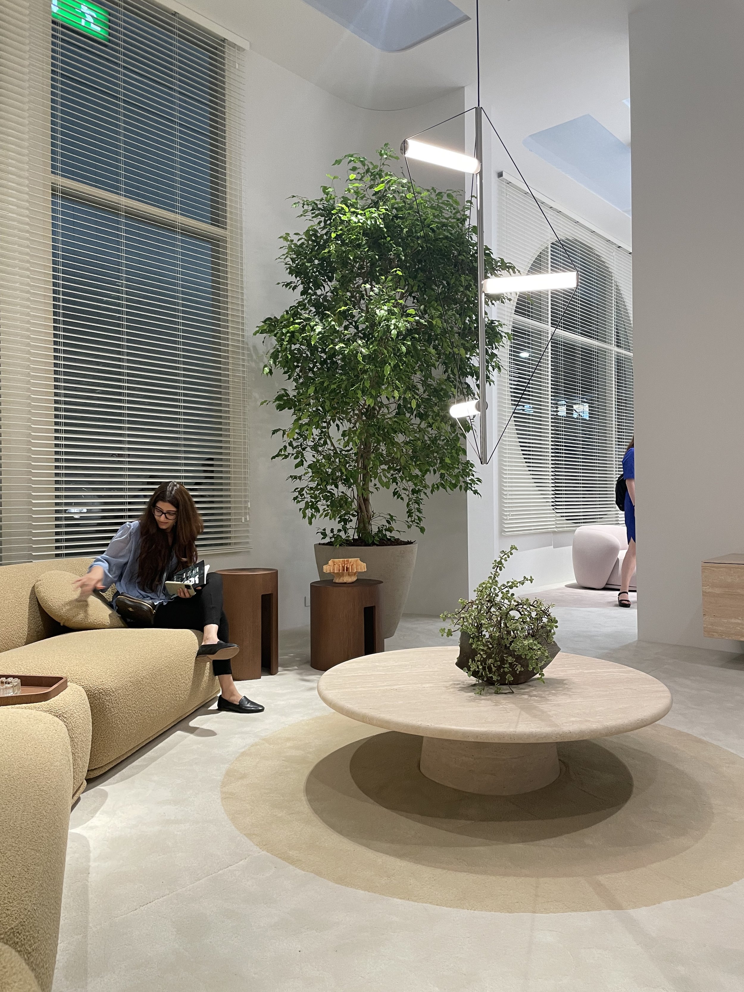
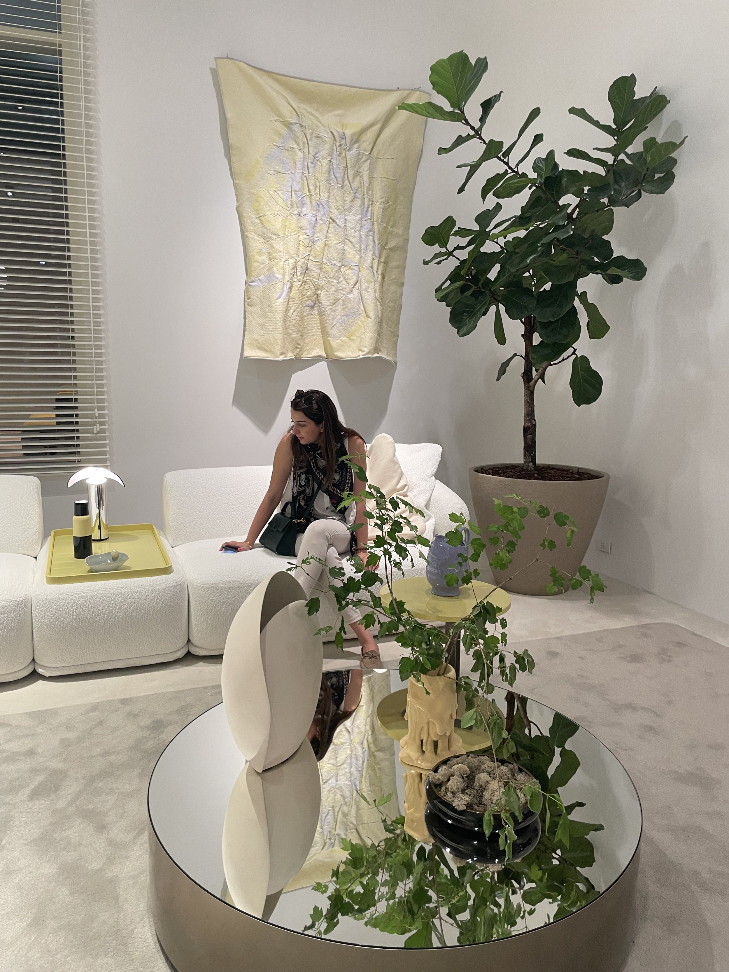
Peek through some of our favourites from this year that various designers and brands from across the globe had showcased. Starting with,
Poliform
Timeless and elegant are what Poliform used to describe themselves, like invisible yarn binding together a space it lies in. With the design philosophy of geometric lines, inspired by architecture, nature and organic shapes lie their perfectly refined materials and details. The products always have a high aesthetic and functional quality, designed to ensure maximum reliability over time and space.
UBE
These gorgeous ultra chic stools are an element of rupture, a work of art serving the functionality of the living area. Inspired by the seed of the coco de mer, a tropical fruit with an evocative and sensual shape, the stool has a distinctive concave shape, forming a comfortable cradle to sit on. Radical also in its development, it is made from a block of solid wood, in a classic black elm finish.
Baxter
KERAMIKÉ
The saturated and glazed surfaces of Keramiké arise from the image of a naked sculptural landscape, that features reliefs, terrains and paths. A sculptural terrain, like Alberto Burri’s “Cretto di Gibellina”, or a Middle Eastern medina. The tops are shiny but furrowed with soft and harmonious shapes, which blend in with the space they are made for and become a vital part of.
The material used is fine porcelain stoneware, a hard, non-absorbent substance which makes it a highly durable piece as well.
Mogg
THE SELFIE MIRRORS
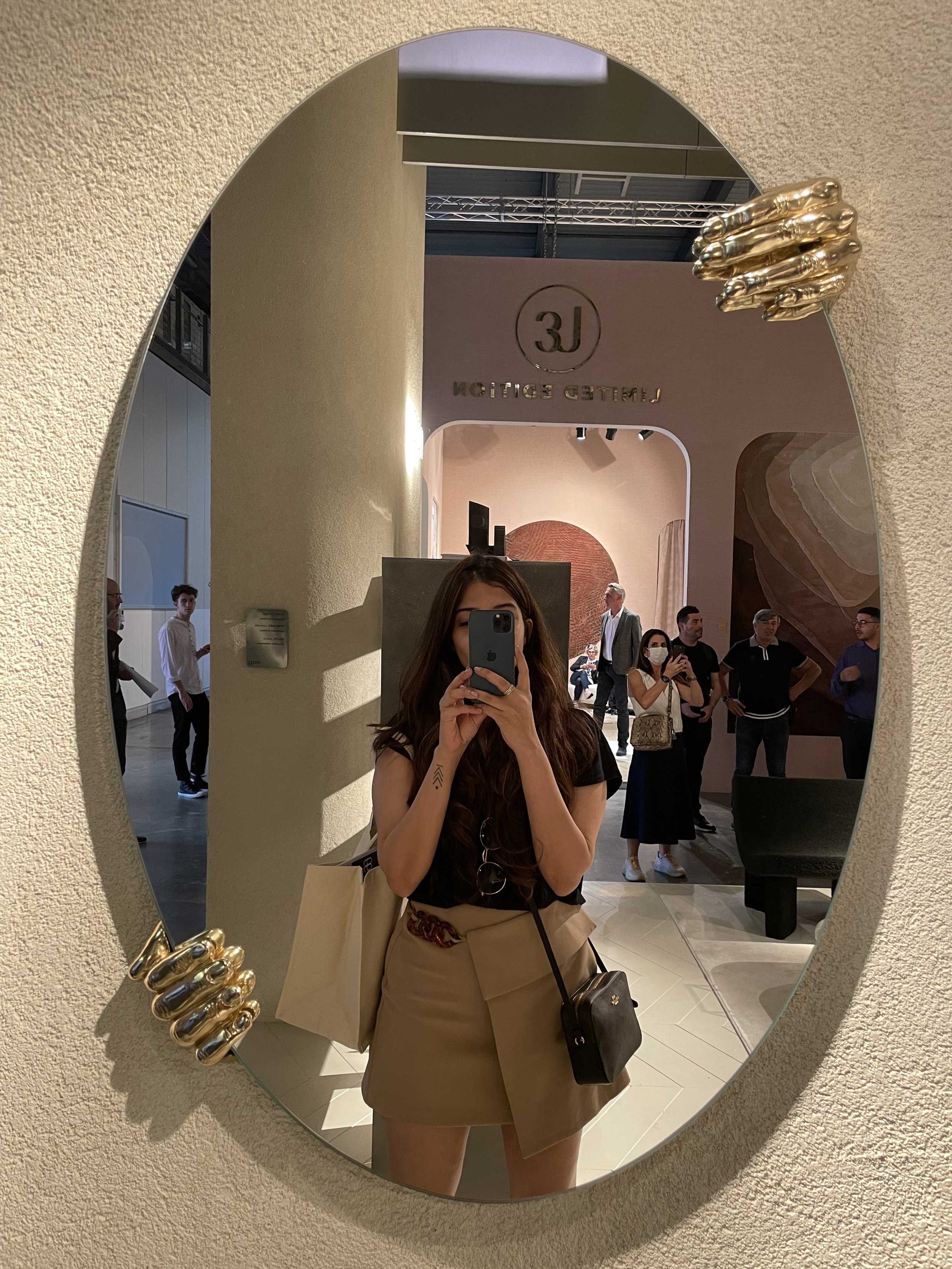
An amalgamation on art and functionality, these mirrors, cast in brass and glass emphasizes on the illusory dimension of the mirror through a series of hands positioned on the edge of the mirrors creating different possible configurations. The intricacy of design in a human hand with all its lines and curves and then to be cast in brass truly makes this one a striking piece.
Roda
PILLOW
These outdoor lights have a soothing and ambient effect in any area to lounge or host in. With its visibly low height and a combination of natural teak and Canatex which works as a highly durable and weatherproof material, these lights act as a fluid source of amping up or toning down a space.
By Kamy
FAUNO MIX DO
Handcrafted in wool, inspired from the beautiful kaleidoscope colours of Brazilian culture and heritage, the Fauno Mix Do collection of rugs from the brand by Kamy exude just that. Several animal figures, such as fish, snakes, and flying insects, are used to create the pieces “Do Mar” (From the sea), “Do Chão” (From the earth), and “Do Ar” (From the air) respectively. These pieces have achieved a faithful translation of the original drawing, made digitally by the artist, who investigated many sources and animal records to gather a varied repertoire of figures.
Zanotta
KARELIA
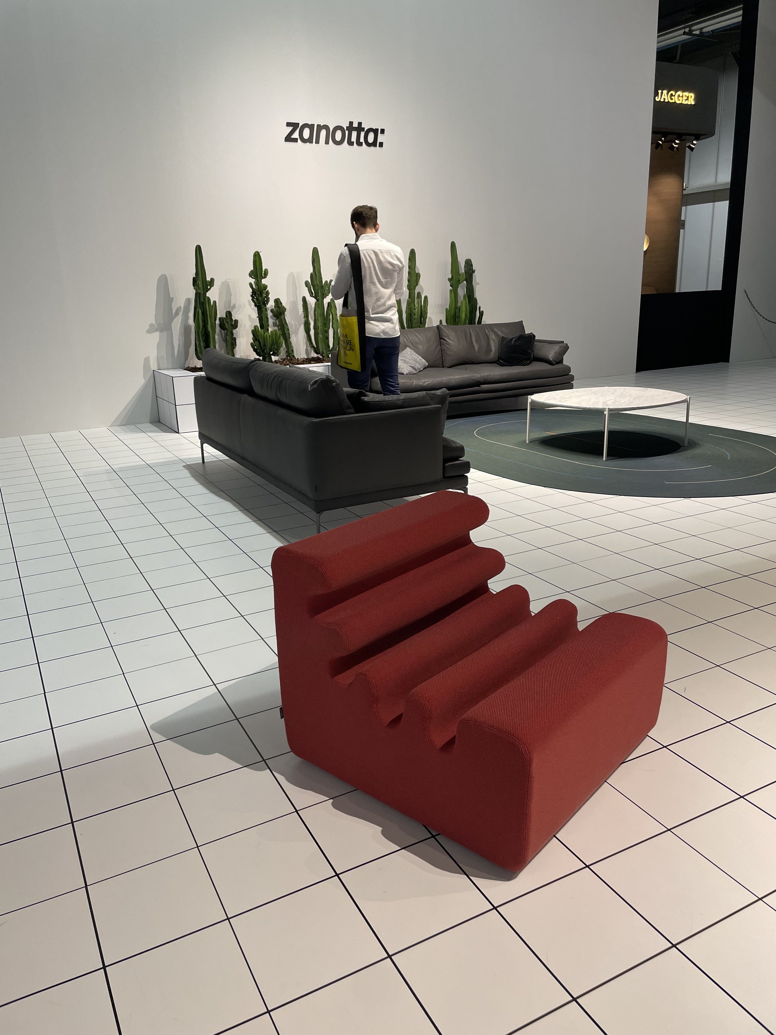
Made entirely of polueurathene foam, this armchair exudes a very retro, pop culture vibe and is a piece of art by itself. It surprisingly also was extremely comfortable to sit on, designed ergonomically, in its beautiful hues and nonconformist forms, it is definitely a piece that caught our design eye!
Pent
LOVA
These luxury kettlebells from the house of Pent are a revolutionary design invention in the world of sports equipment. With its perfect angles, curves and exclusive stainless steel finish, the oiled walnut and leather provide a firm grip and is very hygienic, with no harmful substances being passed on to the user when they perspire. Presented as a set of 7, this kit gives a great visual effect and is ergonomically optimised. Another added benefit of the Pent bespoke products are that they are customisable in a large range of ash and walnut wood as well as various hues of leather.
Dante Goods & Bads
SERPENTINE
The Serpentine, true to its name is a fluidic and endless piece which are the perfect adjectives to describe this dreamy sofa by Dante Goods and Bads. A fully upholstered piece that looks more like a large sculpture than a comfortable sofa which it completely was. Leave it to the virtuosos of furniture design, the Germans themselves to master the art of ergonomically designed minimal pieces.
Fos Ceramiche
PORIFERA
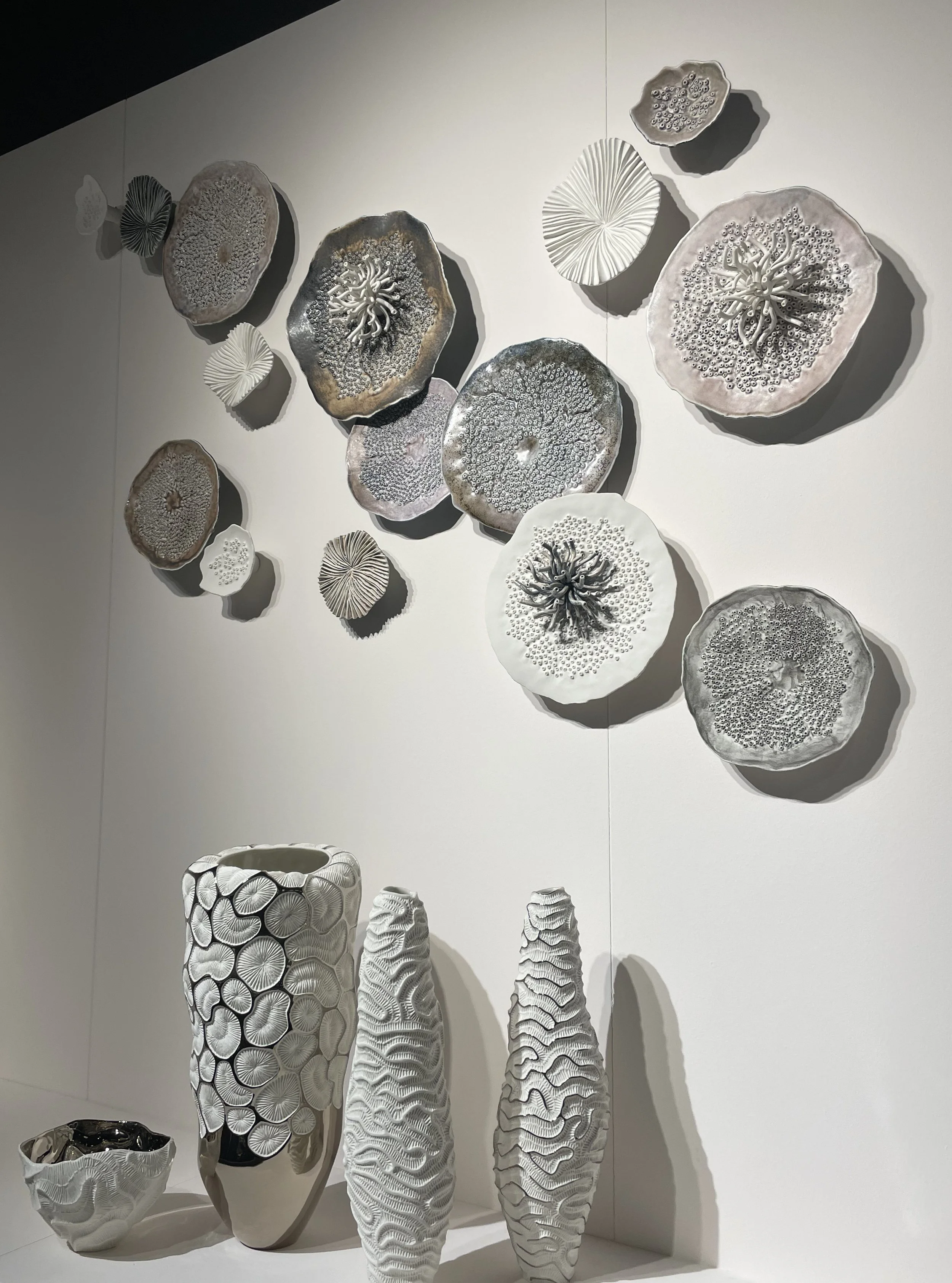
Nature inspired, lighting and wall installation that comes from the magnificent and endless underwater world inhabited by organic forms and translucent character, that comprise of corals, jellyfish and urchins which quite coincidentally also reveal their bioluminescence at nightfall. A piece that beautifully combines lighting and wall decor are these porcelain plates in various diameters and heights, that create overlapping patterns and natural geometries suitable for a statement wall or even ceiling.
Wrapping up all these beautiful pieces of design, we cannot go away without giving a few special mentions to some of our favorites, namely Meridiani which as a whole was nothing short of spectacularly designed pieces ranging from seating to storage in the most beautiful forms and lines. A brand that mirrored a beautiful synergy of elegant modernism and dynamic comfort through its timeless pieces.
Moving onto Guadarte, the style of this brand was a modern interpretation of alluring antiques that emulated a rich, contemporary ideology.
Wrought iron, lighting, upholstery, paintings, mosaics and play with other materials was a characteristic that definitely caught our eye.
And last but definitely not the least, Eichholtz. The pieces here all had made a radical talking point for themselves. With its Dutch origin, the versatility of this company lies in a style created ranging from high-contrast glamour, restrained minimalism as well as traditional touches.
Until next time!
Design Hacks: How To Make Your Space Feel Larger
Our homes now seem to be the protagonist of this particular moment we are living in. Needless to say this is going to change the way we live in our homes and also the way we design them. Since we’re all cooped up more than ever before, the need to enhance the spaces we inhabit arises. We’ve put together a few effortless design hacks that will make your space feel a lot larger than it really is!
“This storm is making me tired”, said the boy, “storms get tired too”, said the horse
A little something we read that keeps us going. As we put pen to paper for this blog post, we really hope everyone is staying safe. It’s been a tough couple of months.
Our homes now seem to be the protagonist of this particular moment we are living in. Needless to say this is going to change the way we live in our homes and also the way we design them. Since we’re all cooped up more than ever before, the need to enhance the spaces we inhabit arises. We’ve put together a few effortless design hacks that will make your space feel a lot larger than it really is!
Include mirrors & reflective surfaces
Surely, this is not the first time you’re reading this - the concept of staging mirrors to make a space larger than it really is, is quite self-explanatory. Place your mirror in such a way that it reflects the maximum amount of natural light - ideally right opposite a window and if it’s sporting a good view, then it’s an additional bonus! Other reflective surfaces woven into the material palette have this notional illusion as well.
Image Credit: Livingetc
Pick neutral tones
Lighten the colour palette of your space. Muted tones for your walls will definitely do the trick! If you want to let your walls scream louder hues, switch up your furniture and soft furnishings to an incarnation of softer, more natural inspired tones.
Image Credit: Livingetc
Incorporate large artwork or artefacts
Yes, for all the art collectors out there, sizeable pieces of art placed on smaller walls will definitely enhance the size of a space. The smaller pieces of art, can be placed slightly above eye level to provide an illusion of taller walls. But, if you’re one of those who likes to intertwine a lot of art through your spaces, scatter it through the house instead of perching it all up on one wall - it will open up the space and keep it more fresh, light and interesting.
Image Credit: Architectural Digest
Embrace statement pieces
One often thinks that a smaller space would require smaller pieces of furniture, however, large statement ensembles, add more character. Use fewer pieces but the right ones to create an impact!
Image Credit: Vogue
Pull furniture away from the wall
Particularly for smaller pieces of furniture, pull them away from the edge of the wall. This makes the space feel more intimate and less heavy. The furniture pieces sit in better accord with one another, which creates a sense of balance resulting in the right conversation between them.
Image Credit: Vogue
Utilise furniture with legs
Lighter silhouettes open up a space. Hence, selecting furniture pieces with legs creates a feeling of more room as more floor area is visible. However, complimenting this with pieces that have a solid base results in just the right equilibrium.
Image Credit: Livingetc
Go light on your shelves
When it comes to shelving, choose floating ones instead of heavy book cases, as they make the space feel lighter and more spacious. However, if you do decide to go with the latter then keep the edges slim!
Image Credit: Unknown
Layer your lighting
Let as much natural light surge through and envelope your space, so it is rendered bright and fresh! Alongside this, the lighting scheme should be in layers and at different levels - on the ceiling, floor and tables. Chandeliers on the ceiling provides the illusion of a taller ceiling - so go ahead and get those statement pieces.
Image Credit: Vogue
Curtains or blinds?
If you’ve got to pick between curtains and blinds, considering the context of this post - blinds it is, as they reduce the heaviness of a space. If you have chosen the former though, then ensure they touch the floor as it makes the height feel taller.
Image Credit: Architectural Digest
Make use of glass
Glass has been used extensively in interior design, for obvious reasons. We all know glass allows for more light to come through and allows for more visual transparency between spaces, making it seem like one space is an extension of the other.
Image Credit: Livingetc
We hope this helps enhance your home and thereby enrich the experience of inhabiting in it. Before we bid our readers adieu, we’ve got to mention a few websites that we have referred to, and echoed with whilst writing this blog post.
https://www.architecturaldigest.com/story/8-clever-ways-maximize-small-space
https://www.architecturaldigest.com/story/decorating-small-spaces
https://studio-mcgee.com/5-ways-to-make-a-room-look-bigger/
https://www.alicelaneinteriordesign.com/blog/how-to-do-big-design-in-a-small-space
Until next time - Stay safe!
‘Sleigh’ed our Christmas decor!
It’s our favourite time of the year! I’m sure a lot of you resonate with a similar thought. It’s holiday season, and there’s just something in the cold December air ain’t it?! This year has been a celebration of moments in a slightly different hue, quieter, reflective moods, family times and smaller gatherings in safe environments. However, significant moments can be created from the mundane too, all one needs is beautiful, apt décor to set the holiday spirit.
It’s our favourite time of the year! I’m sure a lot of you resonate with a similar thought. It’s holiday season, and there’s just something in the cold December air ain’t it?! This year has been a celebration of moments in a slightly different hue, quieter, reflective moods, family times and smaller gatherings in safe environments. However, significant moments can be created from the mundane too, all one needs is beautiful, apt décor to set the holiday spirit.
To set the tone we filled the office with everything Christmassy, whilst sipping on a hot cup of cocoa of course! The highlight was our intimate potluck dinner with the cutest personalised table scape. So now we’re going to reveal our locally sourced elements that completed it, along with visuals that give you a little glimpse into our festive feel.
Reindeers, Nut Bells & Ugly Christmas Sweater Embellishments - Itsy Bitsy
Plates & Paper Napkins - Party A La Carte
Personalised Baubles - @lettering_library
Gift Tags & Stickers - @postcardsfromindia & @blahjaindoodles
Cookies - Freddie’s Baking Studio
Tree, Decor & Table Linen - Ikea
Santa Hats - Party Hunterz
This time of the year is all about high spirits, (yes, pun intended) magic and a little bit of mayhem! This PS Christmas had it all! Mulled Wine, Secret Santa and the Ugly Christmas Sweater contest. As we sit here on our desks and write this post we’re not so secretly wishing we could rewind the clock. Well, since there is no time machine of that sort, it’s back to reality; nonetheless, we are still looking forward to a wonderful new year.
For all the curious ones out there, we’re going to elaborate or let’s say, ramble now, so read on only if you’re interested.
Early this December the buildup of Christmas began with the office all ‘decked’ up and as tradition, Secret Santa chits were picked. After a long wait it was finally time for the Ugly Christmas Sweater Potluck Party. Each of us dressed in our own DIY creativity, yeah, we might as well have been part of the décor, with our shiny, glittery and glee ensembles! All ready and looking the part, we headed over to the lovely set up table and enjoyed our feast entailing a baked cranberry brie bread bowl, Christmas tree spinach dip breadsticks and what not along with some mulled wine. Merry and stuffed to the gills, it was time to vote for the Ugliest, Most Creative and Most Festive sweaters. A tough, tough vote! The rest of the time was spent unwrapping gifts and guessing our Secret Santas by the Christmas tree and then . . . Just kidding :) See you next year!
Sustainable Weaves
A design trend and material that has stood the test of time.
It’s been a fair stint since we’ve written a material post and there’s no finer time to pen one down than now, when we’re currently crushing on this simple, stunning, yet sustainable natural fiber, Sisal. It is derived from the leaves of the Agave Sisalana plant.
On the introduction of this traditional interior ingredient, originally used for rope and twine, there were only a few standard weaves, but now it has reinvented itself and is back with a whole new quirk of colours, patterns and designs. A design trend and material that has stood the test of time.
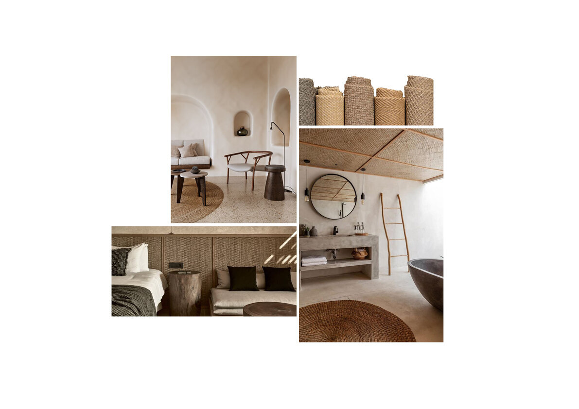
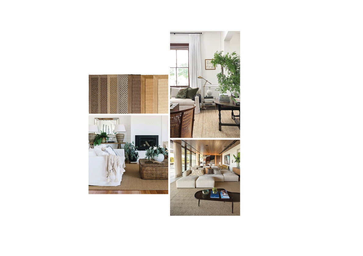
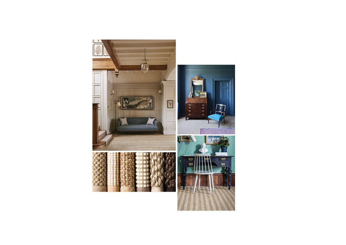
When it comes to flooring options there are a variety of ways in which one can adorn it, and Sisal is most definitely an economical option. It can be used as a simple rug layer or with a mix of floorings to create an artful and playful arrangement. Its versatility enables its use on walls and ceilings as well. The natural hues available - tan, beige and a soothing cream are perfect neutrals that sit well with almost any colour palette. These tones are certainly understated but add character, texture, warmth and an earthy touch. Needless to say it is our current (and forever) go-to!
Using sisal is like eating your cake and having it too! It is aesthetic but also practical (an interior designers dream combo), long-standing, biodegradable, anti-bacterial, anti-fungal and easy on the pocket! Whilst maintaining it is relatively effortless, sisal is prone to staining.
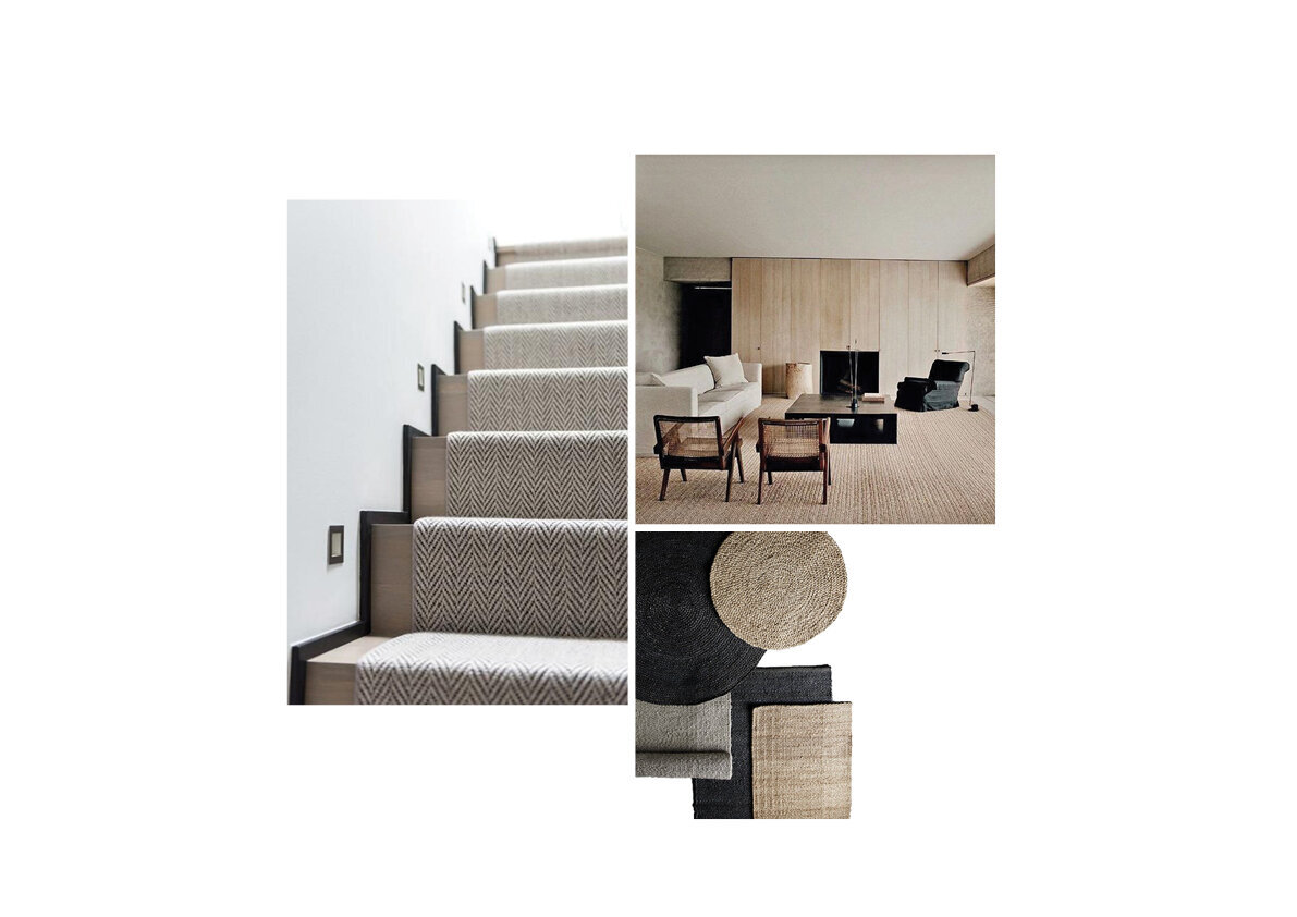
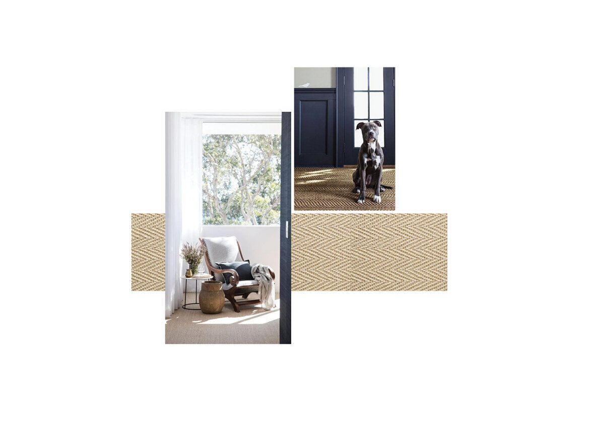
Sisal is a ‘fit all the looks’ kind of material, whether you’re going for a more stately feel or that Restoration Hardware kind of look. Here’s a PS tip for some styles that we think sisal will fit as perfectly as hand in glove, or let’s say, bagel and cream cheese. The coastal, the country style, the rustic, and even the contemporary and mid-century modern too! Some moody mood boards put together below give us a little glimpse of just how.
We’re marrying this charming floor covering into two of our current designs and are feverishly excited to see the spaces unravel as a whole already. Stay tuned for when we let this cat out of the bag!
PS ~ For all those living in humid places, note that this material acts as a natural dehumidifier.
Expectedly it’s going to be a loooong love affair, Sisal.
Vaastu Checklist: The Residential Edit
A traditional Indian system of planning.
Whilst we would have loved to be globe trotting at the moment, if not for the pandemic, (we’re sure a lot of you resonate with this thought) we’ve had to settle for the occasional daydream, drifting off to our favourite places in between the hustle. It’s been hectic back at the office, lengthy desk hours have kept us engaged. Conceptualising new projects, trying to usher it to life, working on detailed drawings, and juggling a gazillion other things!
However, it’s been long overdue, so we’re taking some time out to write this next post on Vastu. We’re sure many of you might already be familiar with the concept of it. Nonetheless, for those who are not, we’ll brief you a little about it and highlight its importance in design.
Vāstu śāstra – literally means ‘science of architecture’ which is a traditional Indian system of planning. The fundamentals of it aim to establish harmony by using the five basic elements - earth, water, fire, air and space.
As designers our aim is to create a space that reflects an appealing interior style. Whether it’s chic and ultra-elegant or functional and effortless. The primary purpose is to provide a space that has a sense of zeal and renders an infectious positive aura on its users. We definitely think the science of Vastu aids this intention.
We’re going to walk you through certain spaces of a home, listing out vital principles that we try and follow for our projects:
The Main Door Entrance
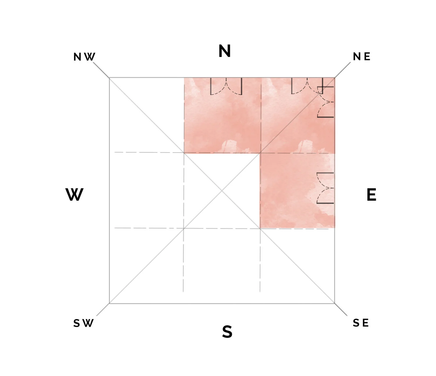
The position of the main door is to face the north, north-east or the east ( which correlates to the rising sun).
The main door should be larger than the other doors of the house.
A well-lit entrance renders a positive effect.
A washroom/powder room near a main door is not preferable.
The Kitchen
The prime place to set up any kitchen is the south-east direction of a home, if not, then the north-west works too.
Preferentially one is to face east while cooking.
Ideally the hob should not be placed next to the sink. Locate the kitchen sink along the north or north-east direction if possible.
The Puja Room
The most favourable quadrant is the north-east corner of your house. If that is not feasible, it can be set up in the east and north corners or even the west side of the house.
The person praying should face north or east.
It is also essential that the Puja does not share a wall with a washroom.
The Master Bedroom
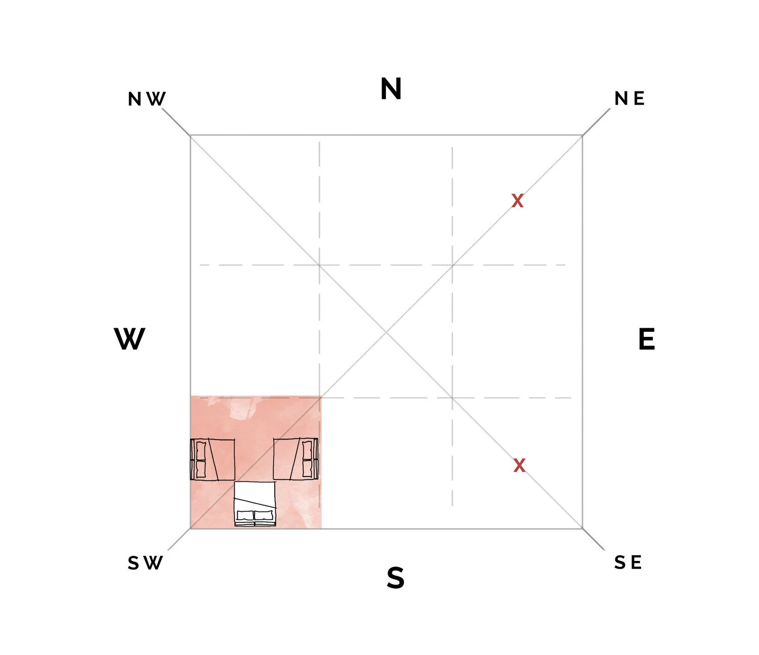
The master bedroom should always be in the south-west corner of the home. It should be larger than the other bedrooms in the house, if possible.
If it is workable, avoid placing the bedroom in the north-east or south-east zones.
While sleeping ones head should preferably be towards the south; east or west works too. Although, one’s head in the North is a big no!
Bed alignment to any corner is unsuitable.
The ideal location for heavy wardrobes/shelves are in the south-west corner.
The Bathrooms
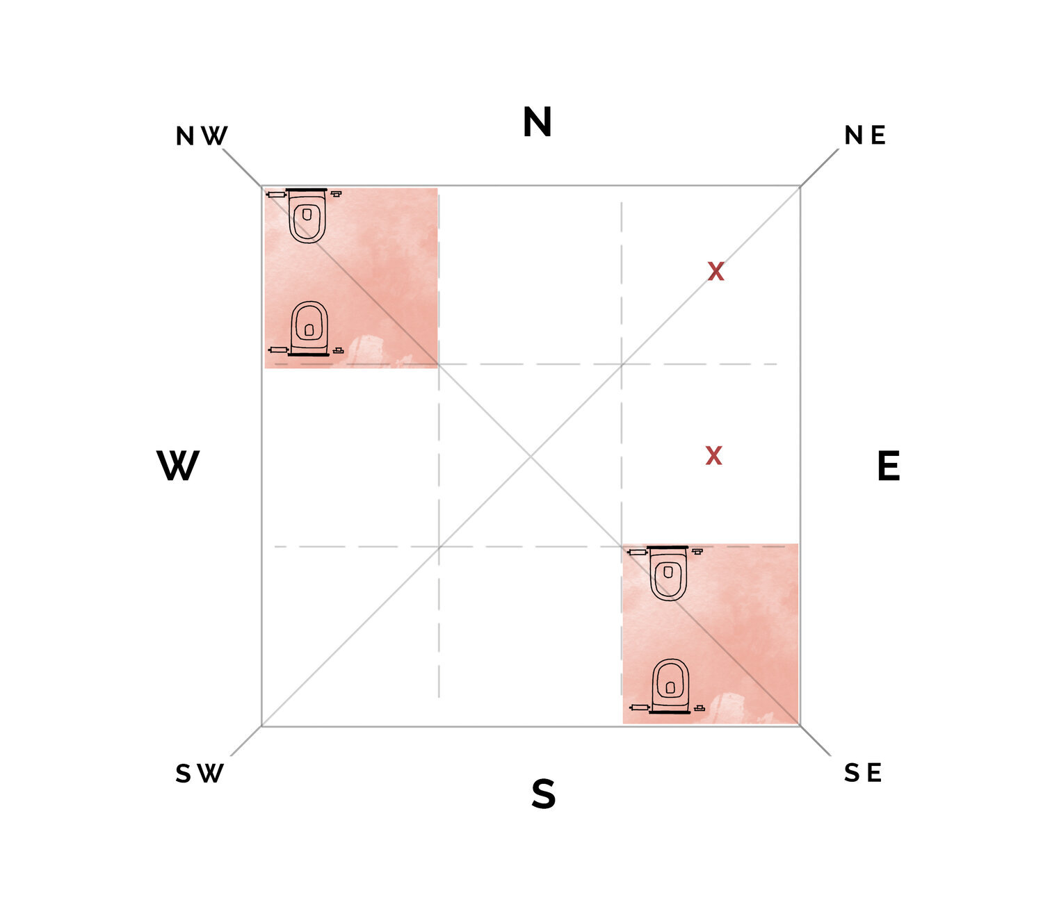
The most appropriate position for the bathroom is the north-west part of a home, however the south-east is an alternative option.
The EWC should be aligned to the north-south axis; the user should not face east or west.
The placement of the EWC inside a bathroom can be toward the west or north-west.
Strive to avoid placing washrooms along the north-east or eastern side of a home.
General Vaastu Tips
Mirrors facing each other ? - Give it a miss!
A mirror should not be placed in front of the bed in any bedroom.
If there’s a beautiful view outside the window, then it would be advisable to place a mirror right opposite. (Well lucky for us this works aesthetically too!)
If possible, steer clear of beams or girders running across the living area.
In the dining area, sitting under a beam while eating is certainly not the perfect thing to do.
Avoid placing the bed below beams in any bedroom.
Facing east or north while studying facilitates it. .
Rooms should be airy, bright and well lit.
Keep spaces clean and clutter free. (We’re going to go do that right away!)
This has been a factual post, and hopefully will be one, for a some of us, to turn to time and again. The websites that were sifted through to put this together are listed below:
https://www.beautifulhomes.com/design/feature/vastu-shastra-for-home.html
https://www.urbancompany.com/blog/interiors/kitchen-vastu-tips/
https://www.architecturaldigest.in/
https://www.vastushastraguru.com/bedroom-vastu-shastra-tips/
Our brain is only thinking about cardinal directions now but we’ve got to get back to the direction of our desks! Well, keeping up with the tone of this post taken off a traditional leaf, Namaste from our team... until it’s blog post time again!
PS Design Process
The trajectory of a project from start to finish.
We at PureSpaces are drawn to and love the whole process of interior design as much as we love its end product.
After receiving a client brief (sometimes even reference images and existing site images), we cannot contain the zest of a new project. It’s like an artist who receives a blank canvas, there’s a rush that we simply can’t help which runs through every fibre of our being.
We’re going to walk you through the trajectory of a project from the start, and how it transpires into a culminating design (which you might have got glimpses of if you follow us already)
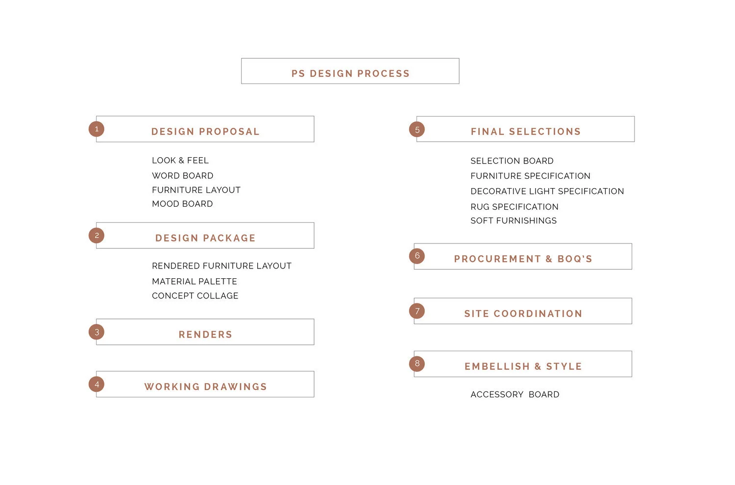
1. The Design Proposal
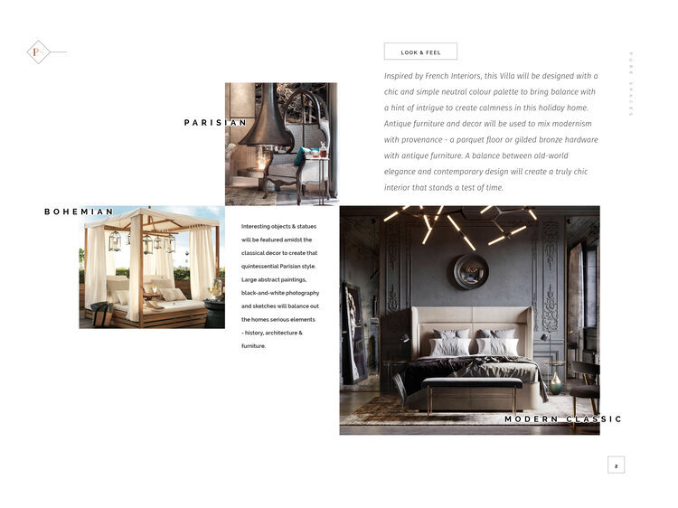
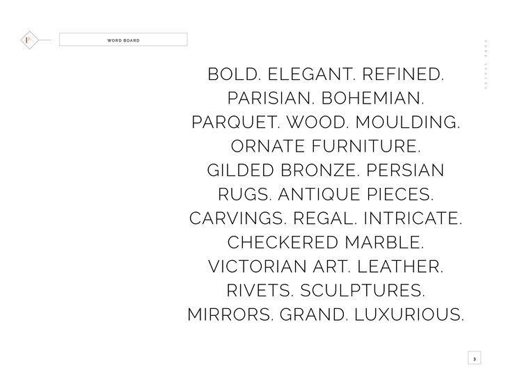
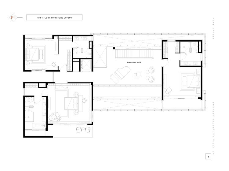
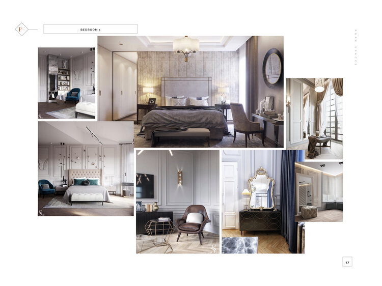
Stage one of this intriguing process begins post absorbing and studying the brief, existing site conditions and its context. The design proposal entails an initial presentation that exudes the mood that we are trying to create. Reference images for each space are gathered by scoring through various design feeds and magazines keeping in mind the style. This overall Look & Feel is brought about through a Word Board and Mood Boards alongside a Furniture Layout which fits in all the client requirements on plan.
This initial step aims at drawing inspiration and gathering client preferences.
2. Design Package
Here our inspiration begins to turn tangible and the design story slowly weaves itself together. Concept Collages or Schematic Elevations are created for each space, along with a proposed Material Palette and Rendered Furniture Layout with a suggestive design intent. Simultaneously we’re also scouting for materials (perfect marble, tiles, and really, the list goes on…).
This experimental step propels the project in a certain direction, indicates the initial feel of the design and how different elements sit together.
3. Renders
It’s not always work and no play. The next exuberant juncture involves bringing the conceptual ideas that we have envisioned into a three dimensional software that truly brings the space to life. These 3D models are rendered to enable a more accurate visualisation of each space. The aesthetics come through here, with a bit of tweaking and altering that takes place.
We absolutely love how sprightly and vital this part is for our clients as well as us as designers.
4. Working Drawings
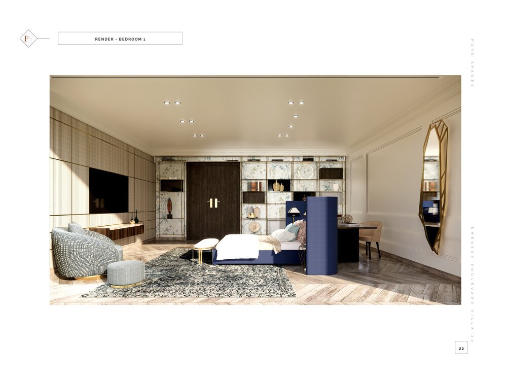
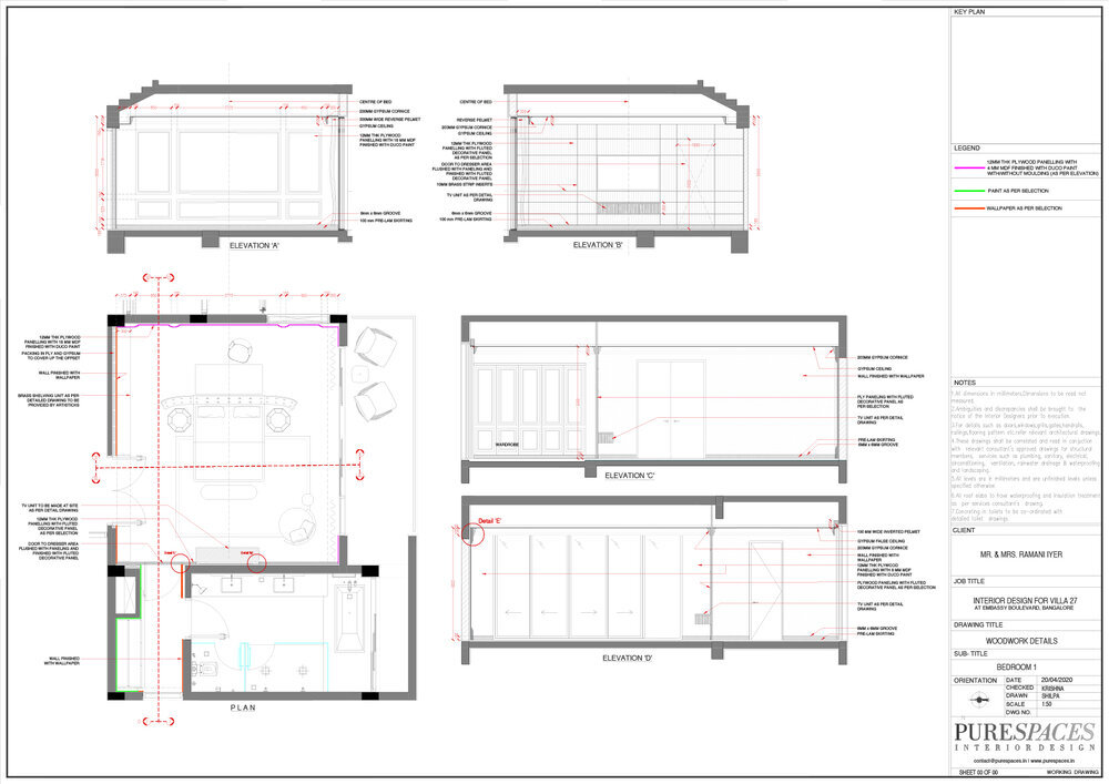
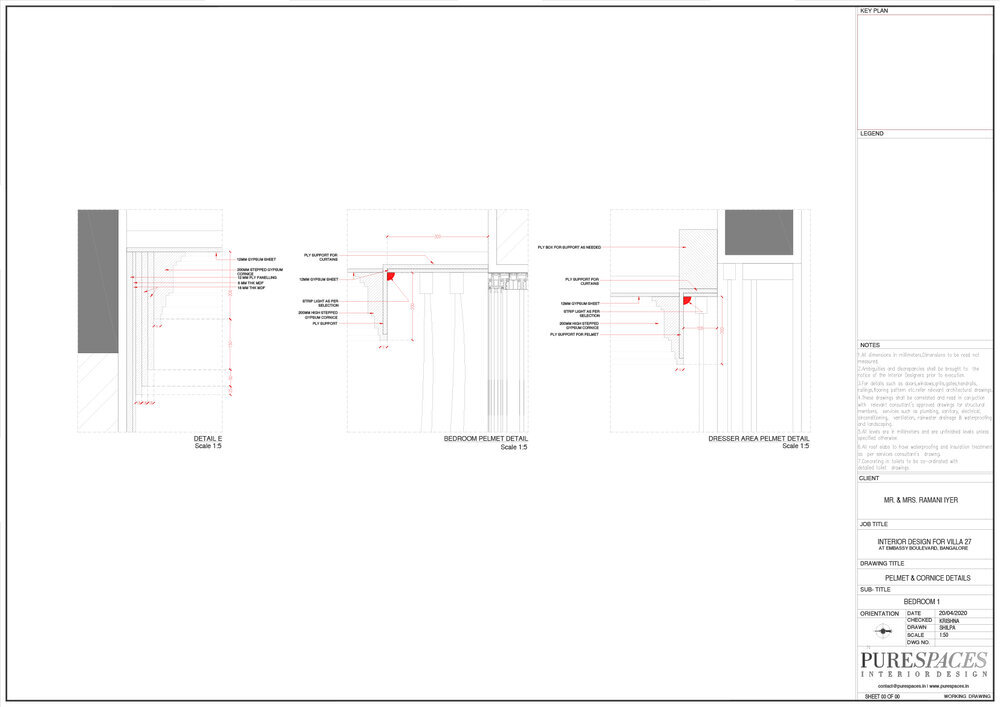
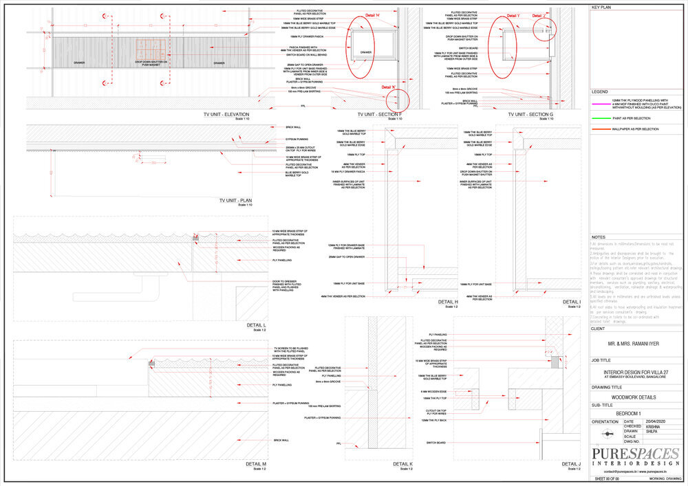
An Interior Designer’s way of communication to its site staff is good drawings. Once the Renders are approved by the client, Working Drawings/GFC’s are created. These well legible and precise technical drawings are produced to hand over to site. This includes a long list and for the ones keen to know, here goes:
Furniture Layout
Flooring Layout & Details
HVAC Layout
Reflected Ceiling Plans/False Ceiling Details
Technical Lighting Layout & Details
Electrical Layout
Door & Window Details
Toilet Details
Staircase & Railing Details
Wall Elevations/Cladding Details
Kitchen & Wardrobe Details
Detailed Furniture Drawings
Before the drawings are handed out, they go through a Quality Check (you bet!). Here are a few things we make sure are perfect:
Layout Format – Drawing Title, Scale, Date, Sheet Numbering, Revision Details
Design Constructability – Revisions & Corrections
Graphic Consistency – Lineweight & Linetype Scale / Standard Legend & Symbols
Legibility – Text Style, Text Height & Dimension Style
Professionalism – Nomenclature, Annotation, Spelling & Grammar
5. Final Selection
Decisions, decisions. We’ve definitely got to make the right ones here! This step helps us read together all the pieces curated so far by creating a Selection Board. This phase shows a clear picture with all the components and materials in their respective context to see how the spaces read together. Once we’re satisfied with it; the selected Furniture, Upholstery, Decorative Lighting, Rugs, Drapes & Soft Furnishings are detailed out separately and sent for quotations (both bought out and customised).
This stage helps us close on things, safe to say we’ve sealed it all by now.
6. Procurement and BOQ
Well, finally we’ve gotten to specifications, requirements, vendor quotes, final bills and receipts of payments. Quantities, numbers and figures play the part here and our calculations, coordination and comparisons see us through.
7. Site Coordination
On completion of all the above stages, signed and concluded. It’s then time to hit site. We make sure site visits take place periodically to ensure quality control, execution of design as per drawings, projected timelines and sorting out any difficulties that crop up.
8. Embellish & Style
Every detail further articulates and enhances the beauty of a space. Hand picked accessories, artefacts and art placed in the right fashion only further adorns it. This step of finishing (which we personally prefer to do) adds that final touch! ✨
Whilst, it’s undoubtedly magical to see a vision come to life (and how) we hope this post was informative and gives you a fair glimpse into how things work around here. We hope you’re staying safe and healthy!
Design Tips for a Post-Pandemic World
The PS Edition.
We all know the importance of design in everyday life and how spaces define the way we live. This months blog post is going to be about the current COVID-19 virus and how it has and is going to influence designing spaces in the future.
“Recognising the need is the primary condition for design” - Charles Eames
As we recognise the current need to re-evaluate design at this juncture, we’d like to share some tips on how we can contribute as interior designers by tweaking certain aspects of design.
Smart Planning & Design
If virtual working is successful in the coming years, it will change the fundamental proposition of a common work space which will entail planning specific dedicated WFH spaces for increased efficiency. Public spaces too can be designed in such a way to make one think of it as their own, rather than public property, which will automatically increase a sense of cleanliness.
PS Tip: Create little nooks or corners that act as mud rooms in public, semi-public and private spaces. An area where people can keep their shoes or outerwear, ensuring the rest of the spaces stay clean.
Material Selection
Materiality, an aspect of interior design that contributes to the very essence of it should be chosen more conscientiously. Responding to the current pandemic and for the future, spaces must be designed in a more hygienic way, public spaces in particular. Materials that are anti-bacterial, easy-to-clean, sustainable and free from joints, could be used as much as possible such as epoxy, cork and seamless bamboo.
PS Tip: Copper and its alloys brass and bronze can be used for frequently touched surfaces (door knobs, handles, buttons and taps) as viruses don’t last as long on these surfaces in comparison to other materials.
Setting the right mood
On the other hand the focus of materials in private spaces should be concentrated more on creating an environment that is clean but also one that uses the right colours and textures to uplift the mood of the user, considering the sheer amount of time that will be spent WFH.
PS Tip: We suggest colours, textures and prints that mimic nature. Neutrals plus cool colours that can produce a calming effect, coupled with some spaces rendered in warm (bright and pastel) hues that are uplifting and have a cheerful effect.
Utilising natural elements
The amount of natural light and ventilation received also assists in keeping your environment sterile. We as designers should allow for a maximum amount of these natural elements to percolate through. Consequently, working with ones surrounding context and respecting the climatic conditions (more so since we live in a tropical country), is essential.
PS Tip: Allow a surge of sunlit rays through your spaces, avoid the aircon as much as possible and stay sun-kissed!
Buying local
This time spent in lockdown has forced the world to de-globalise itself and has got us all thinking about how we can depend upon local craftsmen, and in turn support our economy and be self-sufficient.
PS Tip: Check out @theindiadesignfund for beautiful and locally crafted pieces, curated by leading names of the industry in order to support migrant workers and craftsmen, the backbone of our field.
Safe interaction
When we gradually start gathering at public spaces again (whenever that is), a ‘no contact policy’ must be enabled; the concept of automation, technology and no touch surfaces, will ensure a more safe environment. Some areas where this can be used: automated doors, or public restrooms with no doors, voice activated elevator controls, cellphone controlled automation, handsfree light switches and temperature controls.
The ergonomics and standards will have to be re-looked at as well to ensure that one has a larger personal bubble in high density spaces such as restaurants, cafes, offices, and malls.
PS Tip: Opt for restaurants with a strict no contact policy! :)
Whilst social distancing might seem to be the new normal (which will hopefully be a temporary phenomenon), this situation, though, will certainly encourage us to design keeping all the above points in mind.
We hope this helps! Stay safe.
Our Little Family
A zesty informal behind-the-scenes look at each persons quirks and qualities.
This months post is going to be an easy, candid read. While you may have already had a glimpse of how each person contributes to the PS team, today we’re going to take a zesty informal behind-the-scenes look at each persons quirks and qualities by delving into the personalities and vibe of each one. (Some of it might get cheesy too since we’re all in quarantine and distance makes the heart grow fonder!)
BOSS LADYKRISHNA MORZARIA
Presenting the beating heart of PureSpaces (with her faithful shadow of course, our very own mascot - Meeko!) At the risk of sounding cliché, Krishna is one of the most stellar bosses - compassionate and inspiring, poised and empowering, she is motivated and motivating. This Boss Lady embodies the spirit of perfection (and how!). The notion of it not only permeates to interior design but also her personal eloquent style and life-style. Right from the most minuscule aspect of an idea (yeah, you bet, even the exact pixels between images in a presentation) to the overarching parti of a project (PS parti-es too). Perfection, Perfection, Perfection - Yes, you know we’re trying to scream the word, as that’s what truly defines her. Beyond the realm of design, Krishna is wonderfully empathetic and makes sure our little family is always well taken care of.
Fun Tip: Never say no when she offers to make chip and dip, you’ll know exactly why after you’ve tried it!
She HustlerPARI SHETH
Hustlin’ through the week, Shufflin’ through the weekend. Pari clearly kills it with her floor plans as well as on the dance floor. One of the things we absolutely love about her is her brutal honesty which she applies unreservedly to both her work and when one needs reliable advice. She is dedicated and meticulous, outspoken and helpful. We’re sad to see her leave this month and will sorely miss her and her perfect chilli cheese toast that we’re always ready to binge on! After reading this we could almost bet her reaction is going to be .. “really?”
Fun Fact: Her ability to frequently use this word in question is unparalleled! ;)
MISS CONCEPTUALRITIKA KHANNA
Ritika, Miss Conceptual, works her magic on our design concepts (surprise, surprise!) to make them remarkable. She has a great eye for all things aesthetic, making her a vital part of the process. She’s a combination of fun, entertainment and creative abandon. At our office parties you can be sure she’ll be the life of it with her quick wit and comments, or just giggling away in general. She is wildly independent, efficient and manages to ALWAYS stay two steps ahead of the game. Her description is never complete without complimenting her lovely long locks!
Fun Fact: For the lovers of the show ‘Friends’ out there, Ritika has to watch it intently everyday while she nibbles on her lunch.
SUPER WOMANSHILPA SUNDRANI
Shilpa is our very own troubleshooter, and some might say the whole package deal! She is passionate and hardworking and is always ready to lend a helping hand to anyone who needs it, especially in her area of expertise - technical drawings! This passion extends not just to design but happily enough to tea as well, you can be sure that she will be the first one to get up from her seat come dusk and make her way to the ‘Chai Wala'. We all await this modest evening ritual because it is a sign of things running smoothly and all the universe in order.
Fun Observation: If you haven't heard Shilpa use the word ‘female’ ever so often, then do you even know her?
Little miss sunshineAKANKSHA HUBLI
Akanksha is not only our ray of sunshine on a cloudy day but also on V-Ray! Our very own in-house DJ, she curates the most apt playlists that sets the mood and tone of the day. Her energy and enthusiasm is infectious, not just in general, but also extends to her work and project management. Her easy going and flowing attitude is noticed along with her chirpy, relaxed, positive vibe. She’s our go to for any tech related problem and gladly helps without hesitation. On another note, she has the most remarkably vivid, questionable and mind-bending stories that one might have ever heard!
Fun Fact: You can be almost sure, like clock-work, Akanksha will wish you a very good morning everyday!
Queen of ArtsLIZBETH MARTIN
Lizbeth is feisty, artsy and articulate! She is talent personified. Her artistic ability and finesse to detail often leaves us awestruck, kudos to her for sprucing up our ‘gram with all the lovely sketches you may have seen lately. When she is in a creative state of mind, she sometimes decides to burn the mid-night oil until it reads perfection! She is approachable, comforting and sweet. Along with her being a conversationalist, she also possesses a unique characteristic of being sneakily funny, due to which ever so often we can’t help but break into fits of laughter.
Fun Observation: Liz is surely not an early bird and needs someone to jolt her out of her morning blues, a lot of artists will resonate with this too!
The Silent (S)HeroSWETA NARANG
Sweta is involved in aspects of the firms practice that include design, drawing, modelling and is our go to content writer too! Apart from juggling multiple roles, she not only caters to an endless (and we really mean eeeendless!) supply of design options but also her unlimited supply of delicious snacks for the team! Amiable, kind-hearted, calm and soft spoken (sometimes even in an alluring voice;)), she is always ready to lend a helping hand with the biggest smile. We like to think of her as our little office mystic, deeply interested in poetry and spirituality.
A Little Poem: We could be almost sure she wouldn’t hurt a fly; as sure of her not using a hair tie.
IllustrateherSRAVANI MODEGUNTA
We’re going to try and ‘illustrate her’, except here, through the use of words and hopefully as well as her creatives for this blog post (if that’s even possible). Sravani is the latest addition to the PureSpaces fam, nonetheless her quick, enthusiastic replies on group chats and e-mails make us believe otherwise! This innovative introvert of our office is insanely talented and also possesses skills that are idolised by the whole team, especially her stunning schematic presentation drawings. In a nutshell we can safely say - our go-to graphic genius! She’s shy (at least for now), sweet, modest and extremely helpful.
Fun Observation: We absolutely love how she can carry off those cigarette pants, and are wholly crushing on her every time she’s spotted in them!
FORMER FAM MEMBERS
Once someone has been a member of the PS fam, they’re always a part of it! We’re going to write briefly about our former colleagues, whom we fondly miss and without them we wouldn’t be where we are today!
Let’s start with Kamini, who began this journey with us back when working out of your home office in PJ’s wasn’t a thing. She was an embodiment of fun and spontaneity, and the creator of the PS Blog. If not for her we wouldn’t be writing this today, and you wouldn’t be reading it (that is if you’ve made it this far!). Not to forget her “office politics” and the questionable calls for her from some overly interested potential “clients”.
When we think of Suja, the first thing that comes to mind is her fetish for all things “bling!”. Her meticulous and soft spoken nature will never be forgotten, neither will her habit of constantly snacking. Whilst the rest of us here were embracing the tropical weather, Suja on the other hand was always layering up as if she was in winter wonderland! So if you find her wrapped up in a shawl or down jacket, don't look perplexed.
Then there’s Anna, just like ‘Everybody Loves Raymond’, well you can bet, Everybody Loved Anna! Our former Render Queen, her persona exuded with kindness and compassion. Along with being shy, modest and helpful, we were quite certain she had no bad bone in her body. Our favourite pick in ‘The Voting Game’, game nights are not the same without her!
And last, but not least, Prarthana - “Self conscious?? I’m self obsessed!” Our go-getter girl, always ahead of the game. Definitely a peoples person; outgoing, outspoken and always spreading positivity. She made all the newbies and interns always feel welcome (and maybe sometimes intimidated). She’s one person who is always up for anything and does not know how to say no!
We hope you liked reading this BTS post that we’ve been meaning to write for a while now. We also hope everyone is quarantining and staying safe! Until next time…
Wine O’Clock: The Women’s Day Edition
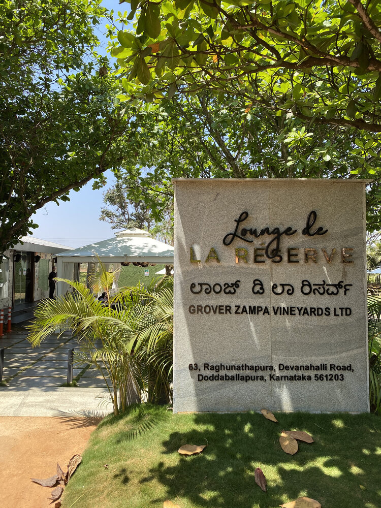
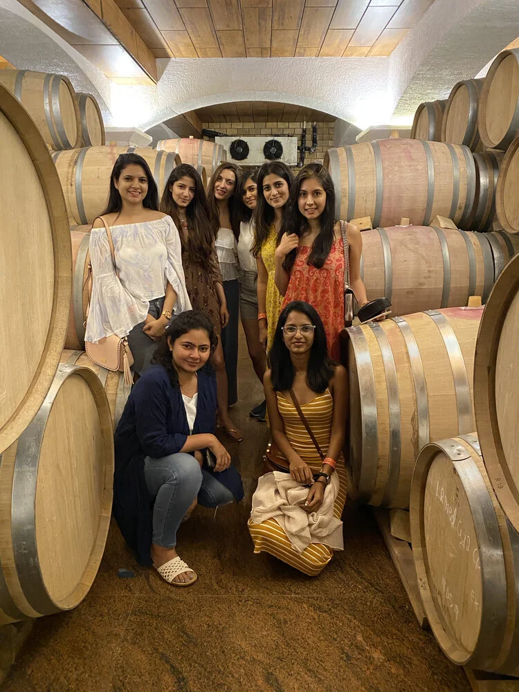
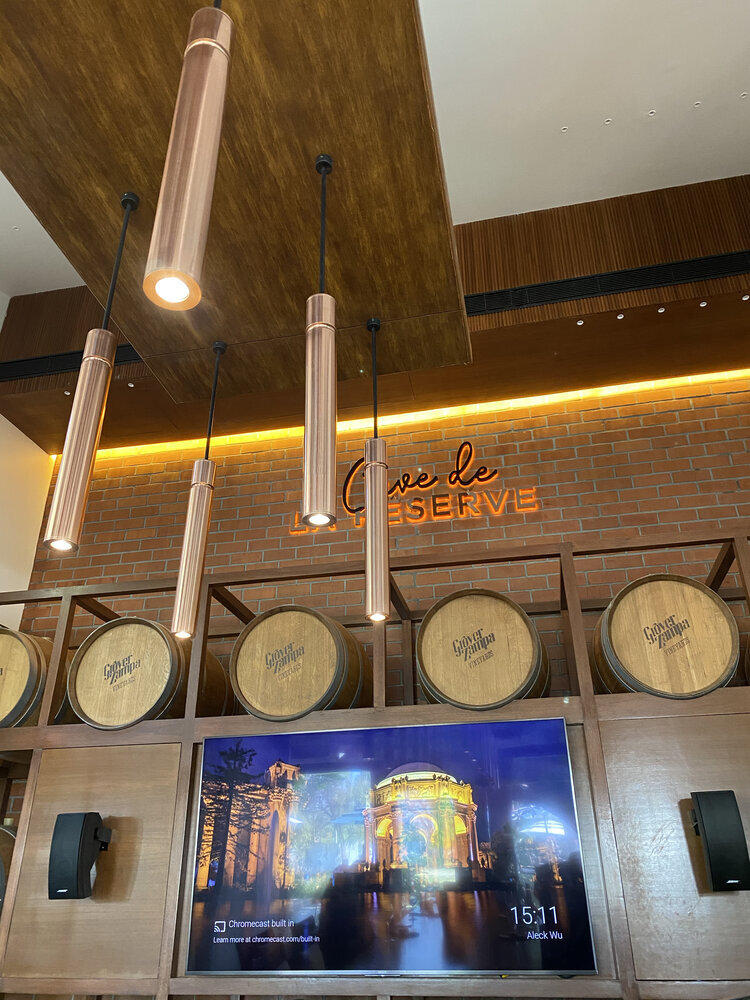
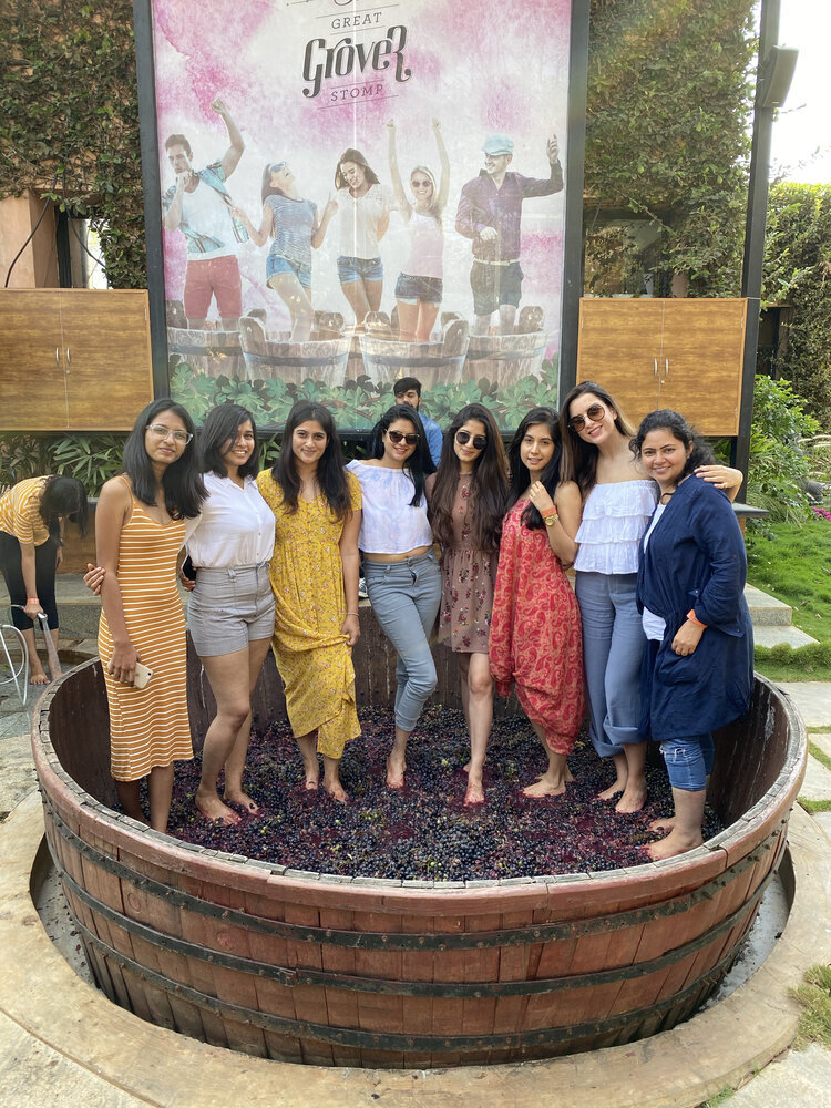
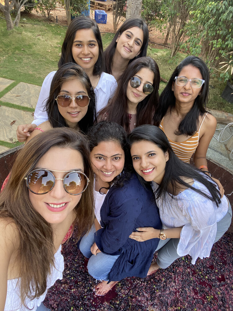
We’re back with our PS blog post for the month, this time we’re going to rewind the clock to two Sunday’s ago, before the lockdown, before we were all cooped up. To commemorate a late women’s day, the team at Pure Spaces visited the Grover Vineyard for a day of wine sampling, laid back conversation and above all a celebration of womanhood.
We’re back with our PS blog post for the month, this time we’re going to rewind the clock to two Sunday’s ago, before the lockdown, before we were all cooped up. To commemorate a late women’s day, the team at Pure Spaces visited the Grover Vineyard for a day of wine sampling, laid back conversation and above all a celebration of womanhood. Setting out on our escapade, on a bright morning, we drove down to the vineyard, slow music making its way lazily up the speakers.
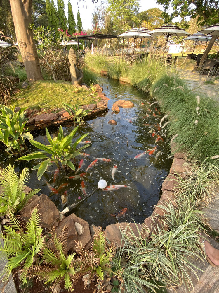
The vineyard was located only a short drive outside the city, a quick journey to what can only be described as an oasis of vines, of grapes, of a soft stillness sitting just off the shoulder of Bangalore’s organised chaos and relentless motion.
If you thought 12 noon too early for lunch, you’d be absolutely right…and yet, that’s just what we did! Marching straight up to the lunch cabana and plonking ourselves down to begin what would be the first of five amazing courses. I’m not even sure we could recount exactly what we ate – that’s how deep the food coma that embraced us post-lunch was. Truly, is there anything better than lying on a comfortable lounge chair in the middle of a viridian green lawn, stuffed to the gills as the afternoon sun slowly falls beneath the curtain of the trees?
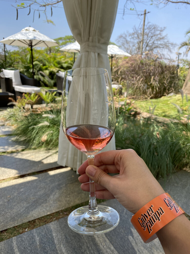
The quiet possibility of the day stretched forward, and what better way to squander – or embrace that possibility than by imbibing ample amounts of fine Rosé wine?
Well, we had done the driving, the eating, the relaxing – and now for the important part – the wine!
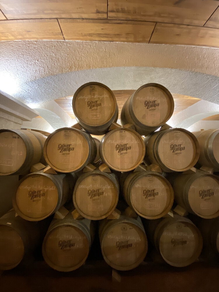
First, the grapes are meticulously selected and sorted from the vineyard. Then they are pressed in machines which preserve the freshness and maintain the softness of the wine. The whole-bunch pressing technique aims at capturing the essence of the grape fruit from the vineyard. Temperature controlled spaces allowed the grapes to be fermented in large stainless steel and concrete tanks, until all the sugar is been converted into alcohol. Once the wine has been fermented and distilled it is stored in oak barrels and even earthen pots. While the oak barrels give the wine a hint of smoke, vanilla and spice, the earthen pots retain the crisp original flavour of the grapes themselves.
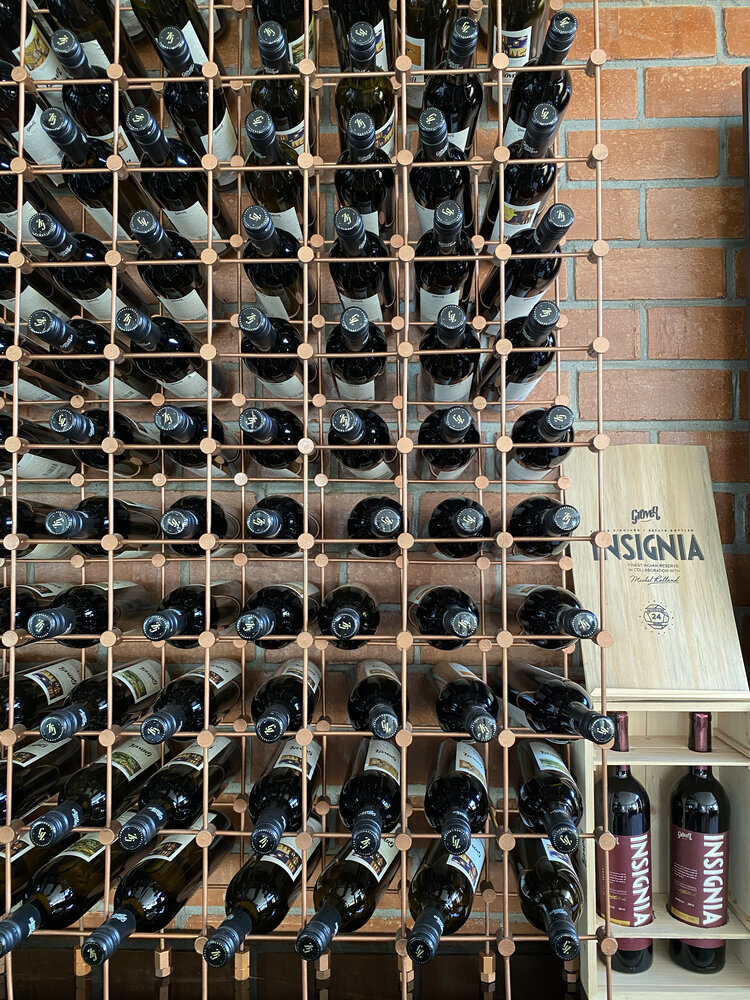
And now on to the tasting! Four types of wine were served and using the short blast of knowledge we received so far, we tried intently to discern the various notes in the wines - their aromas, flavours, the way they sat on the tongue or the way they danced in the light. Sadly, wine appreciation requires a full-bodied palette, a craft in and of itself. One afternoon would never be enough to make us true cognoscenti. But what better way is there to begin, than by beginning?
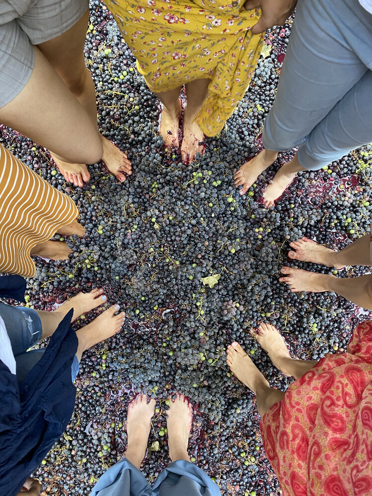
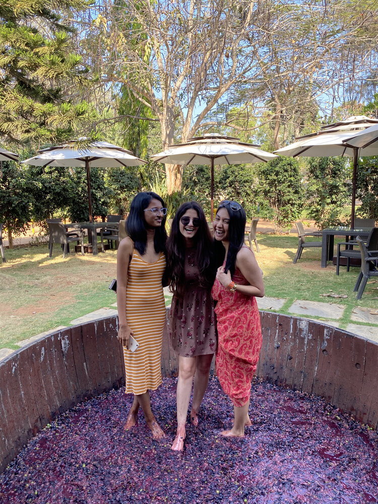
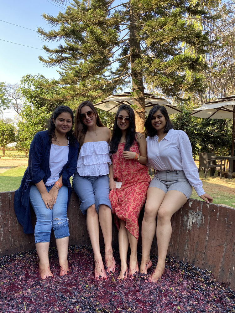
The next part turned out to be our favourite. Grape stomping! Stomp, stamp, stomp – repeat. We went on for the next half hour and it was therapeutic, almost cathartic.
PS Travel Diaries: Croatia
Wouldn’t you love if we almost transported you to Croatia and walked you through our most recommended places? We will be delving into the realm that dates back to the fourth century AD.
And we’re back with our favourite PS –Travel diary series! Wouldn’t you love if we almost transported you to Croatia and walked you through our most recommended places? This prolonged post below does exactly that! We love writing about places we’ve travelled to (as you might have already noticed) and virtually transporting our readers to where we’ve been and how we’ve seen it. We will be delving into the realm that dates back to the fourth century AD.
So here goes, we’re going to throw back to the ground we covered in Croatia and hurl in our recommendations too! While we’re delighted to write this post, we hope you’re excited to read it too! :)
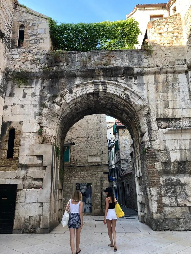
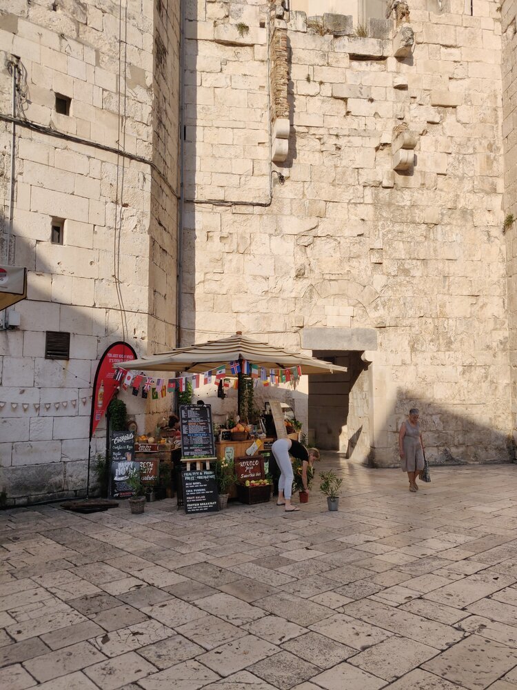
We began exploring Split, a charming Mediterranean city dating back to the fourth century. Its history and juxtaposition of various influences, makes it truly breath taking and we surely give it our PS seal of approval! Absorb the alluring old town by strolling through it; soak in all its magic. The pier too, is beautiful. Gazing at the magnificent blue waters in the distance is a mesmerising feeling. How we wish we could rewind to those blues instead of trying to chase our Monday blues away! Soon we found ourselves walking toward the tourist office at the very end of the main street, where we booked ALLLLL the tours in a state of sheer zeal. Might I add here though, they were all quite splendid.
Close to Split is the KRKA National park famous for its seven waterfalls. Being over crowded suggests that it certainly qualifies as a hot tourist attraction. Although, we must caution you here, the walk to it is long, slow and has a single pathway. Plitvice is another national park in close proximity, noted for its terraced lakes that are linked by several waterfalls. A destination we fancied and were longing to visit, but woefully were unable to.
Still soaking in on all the beauty, our heads filled with natural scapes and blue waters, we got back to an island connected to the mainland. Trogir, is another delightful preserved old town, with endearing, meandering little streets, shops and restaurants. A town known for its whisk of Renaissance, Baroque and Romanesque architecture. We’d advocate visiting this quaint town as a day trip along with the KRKA national park.
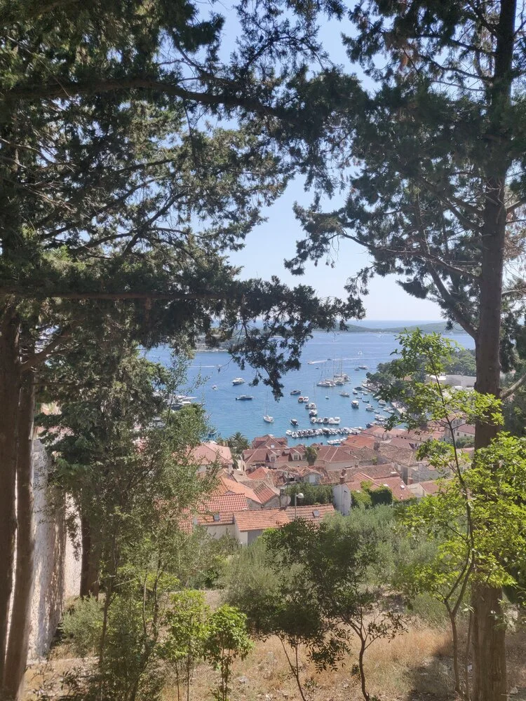
Writing about the next exploration, the five island and blue cave tour, takes our memories back in time and we can’t help but reminiscence about those sublime, tranquil moments spent amidst the fifty shades of blue, a palette of tones that still inspires us. The blue cave tour takes you to the Vis islands an island off the Adriatic sea, where part of the ancient city walls still remain, and you can absolutely explore the underwater world, snorkel or dive. If you’re not such a water baby you can even choose to stay on the boat. The surrounding islands are also magical and if you’re fortunate enough, you’ll be able to spot dolphins gliding through the waves. The blue cave, a unique natural phenomenon, is the highlight of the expedition. This tour concludes in Hvar, another Croatian island that has a similar flavour as the rest of the islands, featuring secluded beaches and its nightlife. If you’re in the mood to party or feel like going bananas, an island called the Carpe Diem beach is the place you should make your way to.
Whether you’re seeking stillness and peace or want to ride the party train around Split’s Archipelago, you can craft it all. We can safely say you’re going to leave rejuvenated and drift into a daydream of Croatia (once you return) that will always remain in the repertoire of your memory. Alright, we’ve got to jolt ourselves and get back to reality. Ciao until we write our next blog post!
PS ~ unexpectedly, we bumped into a manager in Split whose restaurant recommendations were spot on! So here goes . .
ARTiČOK – Small but Scrumptious!
Bokamorra Pizzaurant & Cocktails – For all the Pizza lovers!
Roof 68 – A meal with a view!
La Bogeda – Outdoorsy!
Zinfandel - Hole in the wall but delicious!
Bokeria- Wine and dine!
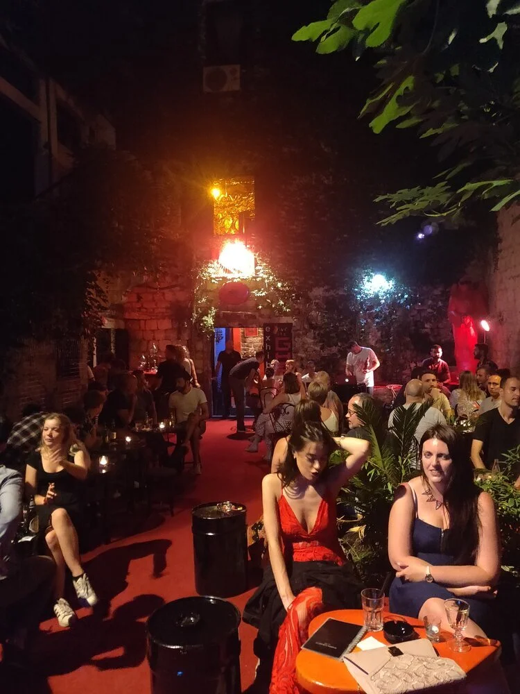
Academia Club Ghetto – Cool bar in the middle of old town!
ZOÍ – Saved the best for the last!
Oh, and how could we almost forget to add, your vacay isn’t complete unless you’ve sipped on a cold Karlovačo beer!
Modern-Classical, Through the PS Spectacle!
Melding simplicity, clean lines with traditional features to create clean yet striking spaces that linger long in ones memory. It epitomises the best qualities of contemporary interior design blended with the drama of modern aesthetics.
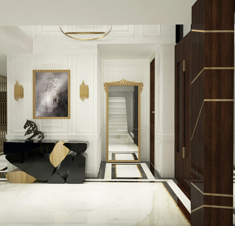
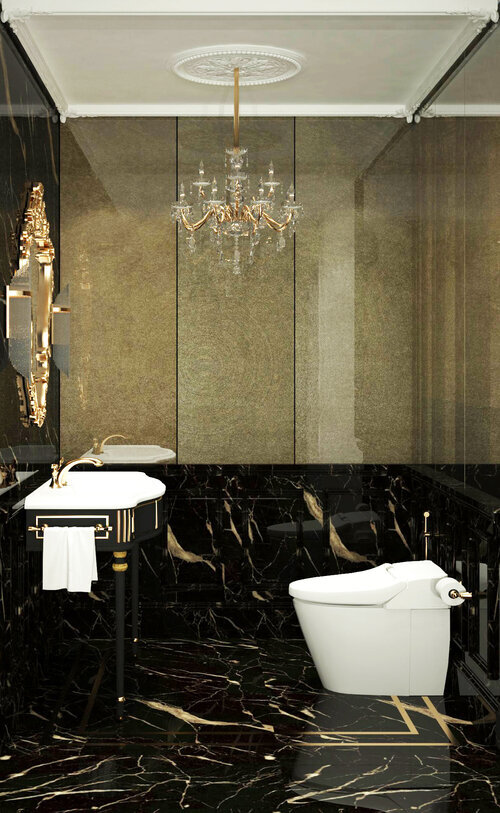
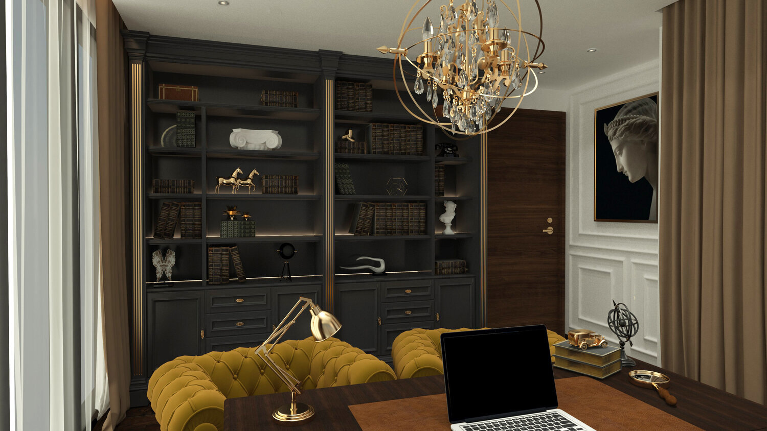
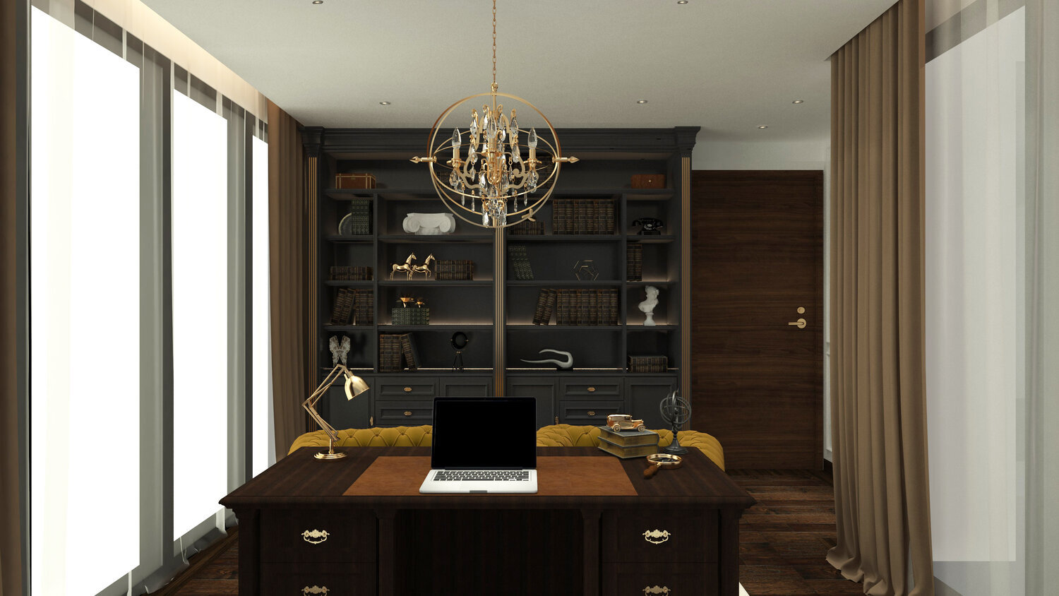
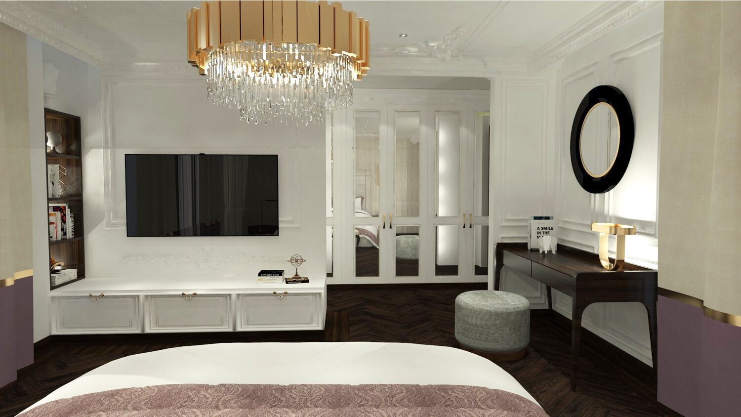
With an assemblage of interior styles to pick from, the modern classical is most definitely our absolute favourite! What is modern classic? No points for guessing here, as the name evidently reveals a combination of modern and classic of course! Melding simplicity, clean lines with traditional features to create clean yet striking spaces that linger long in ones memory. It epitomises the best qualities of contemporary interior design blended with the drama of modern aesthetics. Continually crushing on this 1920’s, 30’s aesthetic we often render our spaces modern-classical. Some of our work vividly personifies this style, as we find ourselves constantly drawn time and again toward it, each time with a fresh quirk. Understated luxury, delicately crafted details along with bold modern geometry, what’s not to like? It’s a sublime coalition! The classic interior style originated from European culture. The Victorian, Art Deco, Greek and the Roman are the main inspirations of this alluring, intricate classic design. Often, modern colours, grey silver, black, beige, chocolate brown, grey blue are vital ingredients to a great recipe of this interior style juxtaposed with wall mouldings which is an intrinsic feature of this effortlessly flowing style that offers endless possibilities of designing a wall. You can make a style more attractive by adorning the space with several accessories. Some tips from the PS Fam: Large geometric patterns, a vase with an accessory, a painting on the wall, subtle carpets or wood often used to add warmth to the space, some spaces spruced up with attractive exaggerated decorative lighting.
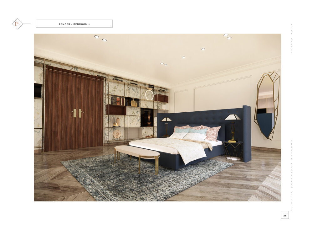
Just Law, a lawyers workplace, Embassy Boulevard Villa 27, a residential Villa and another upcoming residential project, (can only reveal its watchword right now) PG2.0 which is a muzzled secret (only for the moment though y’all) are some of our projects that scream modern classical and how! Quiet luxury whisked with valiant geometric bold floor patterns, delicate wall mouldings carefully crafted, a bold colour palette, statement lighting, bring this style to life. In a nutshell we’d say timeless design characterised by subtle sophistication. We can safely say here, we at PureSpaces gravitate towards this aesthetic like a swarm of bees, each time though, through a crisp, fresh, new spectacle!
Decor ideas for a festive feast
Some of our favourite memories have been created around the dinner table. This year we are encouraging you to relive and re-invent those delightful memories, with some last minute Christmas table decor ideas!
‘Tis the season to be Jolly and then it goes .. Falala.. La La La La La La! It’s almost Christmas o’clock with the candy canes, snowflakes and Christmas trees all around! There’s a gallop of Christmas cheer in the air at the PureSpaces HQ. It’s been a dashing December so far and we are counting down to the Merry day.
Christmas decorations can set the tone for the Holiday season. Some of our favourite memories have been created around the dinner table. This year we are encouraging you to relive and re-invent those delightful memories, with some last minute Christmas table decor ideas below! The Perfect way for you to devour your December food in a Christmas spirited ambiance. We’ve made it as easy as possible, simple yet debonair, with a burst of red whisked with some glint from our top three stores for this season fused with your local florist, to add the final touch.
The PS Fam wishes you a Merry Christmas and a Happy New Decade!
Starburst Red Wine Candles (Set of 3) - Home Artisan
Mirage Lantern - Nicobar
LED String Lights - Nicobar
Poinsettia Flowers
Jacob Red Ceramic Cup with Golden Handle - Home Artisan
Do Not Disturb Deer Curio - Curio Casa
Your Majesty Deer Curio - Curio Casa
The Material Hunt
Not too long ago, we chanced upon Skineer, an incredible product by SK International that we fell in love with.
Design trends are forever changing and we’re always trying to keep up. Sometimes, it’s fun to add a fresh touch to our designs, and at others, it can be challenging to tastefully incorporate something new in a space. Either way, discovering unusual materials and finding ways to use them, keeps us on our toes.
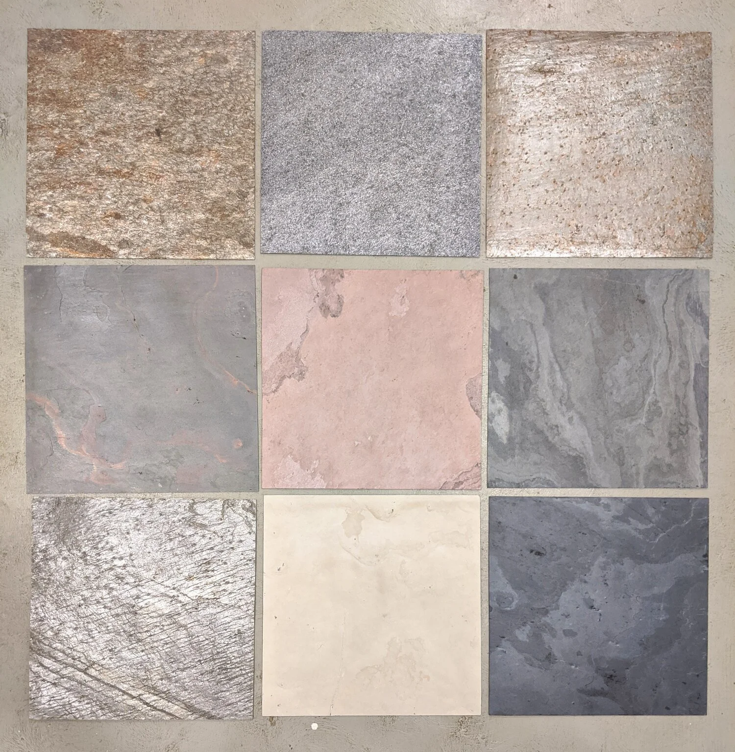
Not too long ago, we chanced upon Skineer, an incredible product by SK International that we fell in love with. They are these paper-thin sheets of natural Slate stone with fibreglass backing that come in two sizes - 8’ x 4’ and 4’ x 2’. Being a natural stone composite, every sheet is unique, and yet it has qualities that the stone never had. They are extremely light, flexible, and available in intense, earthy colours and patterns. There are translucent options available, and all of them reflect the beauty of the real stone. Being extremely robust, they can be used as a surface finish on walls or floors, indoors or outdoors, dry or wet areas. It is easy to cut them into sizes to create any pattern on feature walls, ceilings and even furniture; and gracefully integrate it into any aesthetic while creating a soothing and unpretentious vibe.
In Sriracha, Indiranagar we used Skineer to clad the walls, the ceiling and the sliding door in the robata grill enclosure. To add an element of interest to an otherwise dull space, foot-wide strips of random grain patterns were placed alongside one another, creating an illusion of a continuous wall, when the sliding door is shut. The greyish-brown tones of the strips complemented the rest of the interior scheme and blended unassumingly into the backdrop of the robata grill, not drawing any needless attention to itself. For Just Law, on the other hand, Skineer was used on a partition in the reception, prominently in everyone’s view. Fixing the sheets on a curved partition proved to be a challenge, but we were thrilled with the seamless and stunning results.
It’s a rush we find hard not to chase. Designers and clients alike are fascinated by the ever-expanding ambit of material palettes in the market. They could be either legitimately new or old materials given a new avatar. Regardless, we gravitate towards innovation and novelty like a swarm of bees. PureSpaces is always scouting for the debut of latest products in their design dreamlands (more about these another time). It is always exciting to work with our new finds that add an extra zing to our work.
How do we keep our material palette fresh and trending? It’s a Friday ritual at the PureSpaces HQ to have vendors over to show us an array of materials. It’s most definitely a day well spent curating and adding materials to our existing catalogues.
Jungle Diaries
Team PS visits The Bison & The Backwater Sanctuary.
Team PureSpaces boarded the Shatabdi express to Mysore enroute to The Bison, with overflowing excitement and unsurprisingly, tons of food. While the rest of us were busy stuffing our faces with carbs, Krishna, with her keen eye for detail, was commenting on the Wes Anderson-ish wallpaper in our coach (she's impressive like that). Anyhow, we were in Mysore in no time with bursting tummies and empty food bags. We then drove down the rest of the way.
The Bison is a magnificent resort along the Kabini river at the confluence of Bandipur and Nagarhole National Parks. It felt like we were stepping back in time, as the buzz and rush of the city gave way to a lush green landscape. Nestled amongst majestic trees all around, a refreshing silence welcomed us into The Bison. Those of us, who were first-timers here, (basically all of us, except Krishna) were stunned into momentary speechlessness by the picturesque view that stretched ahead of us. We then met Krishna's best friend - the feisty, spirited and fiercely animal-loving Zoha - who runs The Backwater Sanctuary, an equine rescue and rehabilitation organisation. She introduced us to these beautiful brutes, rescued from far and wide, and brought back to life with much love and care here. She zipped past us in a blur, getting them back to their stables, bringing in their feed and petting whichever of them that came in her way. As the dark clouds rolled in above, we all watched on in amazement. And soon, the thunderstorm was upon us. Just as their website description goes, it is serene and idyllic during the day at The Bison, and exciting at night.
Lightning struck, one bright flash following another, lighting up the sky for the briefest of moments, burying us in darkness after. Far from the usual bustle at work, the PS team watched nature's fury unfold around us. We believe that the magic of creating spaces from scratch is endlessly fascinating; we get to tinker with exquisite materials and textures, and delightful furniture and lighting. But this was a different kind of magic. It was soulful and stirring.
The morning after was tranquil again and we set out on our jungle safari, a first again, for most of us. We drove through the misty woods, on the lookout for a wild-cat sighting. We had no luck with the cats, but we did see a few imposing bisons, some wide-eyed deer and tons of birds that our guide enthusiastically pointed out to us. Someone in our group managed to spot a rare monitor lizard too, that our expert naturalist had missed. All things considered, we were a disappointed lot that went back to the resort. But the delectable food at the Bison can cheer up any disheartened soul.
With renewed enthusiasm we set off to follow Zoha, as she went about her busy morning, tending to wounds with bucket loads of love to her babies. After her morning chores were done, PS sat down to a fun hour of board games until the next hearty meal. The team decided to go on a boat safari, but Krishna decided to stay behind, wary of any water related activity after the precarious boat ride the previous day. The rest of the team was also apprehensive about a 3-hour boat ride, but it turned out to be far more engaging and fun than our morning safari experience. We saw herds of elephants, a croc basking in the sun and some beautiful birds. When all went quiet, it was meditative. There is something infinitely satisfying about observing nature's pace. Life is unhurried and time stands still.
We came back from the safari to a quiet evening at the resort, and tried our hand at Heads Up. There were two glaring conclusions that we deduced -
We were an incorrigibly silly bunch and
We were terrible at this game.
But we had an insanely good time being nitwitted and laughing so hard. Time flew when we were there and pretty soon it was time to head home. But before we left the next morning, Chikkoo, Bison's star boat driver, took us on a Coracle ride. What can we say - it was a spinning experience!! A big shout out to The Bison and The Backwater Sanctuary, and a heartfelt thank you from all of us at PureSpaces for making this an absolutely unforgettable trip.
The Games We Play
It’s always all fun and games here at PSHQ. Just kidding, we actually take work very seriously. After a week full of client meetings, site visits, material selections, detailed drawings and a zillion other things, we ensure to put everything aside and make time for fun.
It’s always all fun and games here at PSHQ. Just kidding, we actually take work very seriously. After a week full of client meetings, site visits, material selections, detailed drawings and a zillion other things, we ensure to put everything aside and make time for fun. Excited to give you a little glimpse of what happens here on a Friday night (in sequential order). Bags of chips and the famous cheese dip come in at around 6 pm. Conference room, of course, turns into the party spot. Laptops shut, drawings folded neatly and the table is set up with drinks and our favourite selection of games. Here’s a list we’ve put together to tell you all about the games we play.
On the top of our list we have JENGA - Not only is this least tricky, but also for all ages and fam-friendly.
How to play
So, once we’ve built our steady J-Tower with 54 blocks (to be precise), we start by carefully pushing or pulling the blocks, turn by turn, and placing it right on top with just one hand. As easy it sounds, this requires a whole bunch of skills - great hand eye coordination, strategic mindset, and some serious concentration. While it’s all smooth sailing at the start, our adrenaline levels begin to soar as the tower gets leaner and it’s finally time to say “JENGA” when it all falls apart. Fun fact, ain’t nobody a winner at Jenga, only losers.
Just a ‘Heads up’ - this ones insanely fun. This revolutionary game began on Ellen DeGeneres ’s show and has been a riot ever since. PS: Gets you way too hooked, this was literally ALL we did on our team-trip to Bison.
How to play
This game is a combination of charades and Headbandz. We first pick a category: Superstars, Act it out, Blockbuster movies, Animals gone wild are some of the many. One person takes the role of the guesser and puts the phone to their forehead, while the others act out what flashes on the screen. You get 60 seconds! Meanwhile, if the guesser arrives at the right answer they tilt their phone forward and if not they turn it backward, to pass. You can play as many rounds you want and the person with the maximum number of right guesses is the winner.
The Voting Game - Quite dangerous because every time you play you get to know what your friends reeally think. Also, turns out to be ridiculously funny. Caution : It’s practically impossible to stop, once you’ve started. Also, Krishna’s a cool boss so here we play the NSFW version.
How to play
Each player gets a player ID card which identifies each player as a number for the rest of the game and players also get a set of numbered voting cards with every number except the one on their player ID card. Turn by turn, one person draws a black Question card and reads it out loud. Each player then uses their voting cards to anonymously vote for the answer to the question (reader votes too). The player who read the question collects all the voting cards and reveals them to the group. Players receiving votes guess who voted for them and the player that receives the most votes wins the round and keeps the Question card. The first player to collect 6 question cards is the winner!
Cards against Humanity - The ultimate party game for ‘Horrible people’ with a whole lot of adult humor and laughter guaranteed.
How to Play
The game is simple. Each player draws 10 white cards. Each round, one player asks a question from a black card, and everyone else answers with their funniest white card by reading them out together. Reader gets to pick the best answer and that person gets to keep the black card. Person with the maximum number of black cards wins.
PS: The outcomes are absolutely ridiculous, we DIE laughing.
Piccolo Drinking Game – Very easy to play but drinking is a must.
How to Play
- First things first, get drinking
- Download Piccolo
- Add each player’s name
- Pick a mode, such as The Bar Mode/ The silly mode or whatever you’re in the mood for
- And just go ahead and do as the app says, drink 5 sips if it says so!
Before you know it you’ll be well on your way to having a FUN night.
So, this is how we set the tone for a great weekend. We surely believe that a little Booze and a lot of Banter never hurt nobody.
Insta-Worthy Restaurants: London
Some of our fav restaurants, in the city we love. Goes without saying (of course) - the interiors played a huge role in curating the list.
Today, we’re going to talk about some of our fav restaurants, in the city we love. Goes without saying (of course) - the interiors played a huge role in curating the list. Hope this is as interesting for you to read as it was for us to make. Go ahead, read on.
CLOS MAGGIORE, COVENT GARDEN
Influenced by the vibrant summers of Tuscany and the romantic winters of Provence with Chef Marcellin’s perfectly handcrafted menus – this restaurant is a dream.
PS : It’s also always wine o’ clock at Maggiore!
BOURNE & HOLLINGSWORTH BUILDINGS, CLERKENWELL
We know a great place for some late night dancing, street food and al fresco cocktails. Taking inspiration from the faded grandeur of a stately home, B & H Buildings has an informal charm. Whether in the mood for a boozy brunch or a casual coffee date, we’d totally recommend.
REDEMPTION BAR, COVENT GARDEN
Breaking all myths about healthy food, Redemption takes clean eating to a whole new level of sinful! The thought behind this restaurant is to firmly care for the planet, it’s animals and ourselves.
PS: The alcohol-free cocktails are a must try.
SKETCH, MAYFAIR
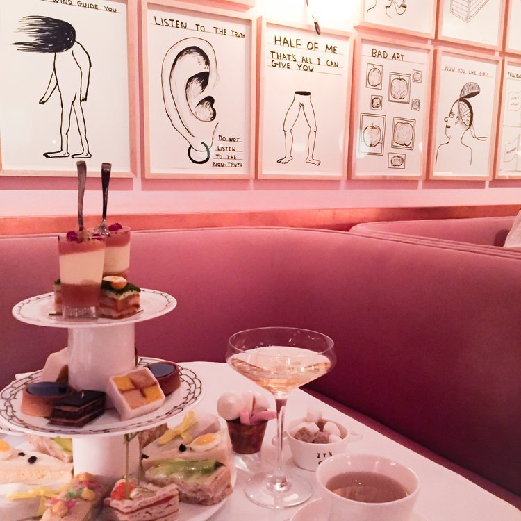
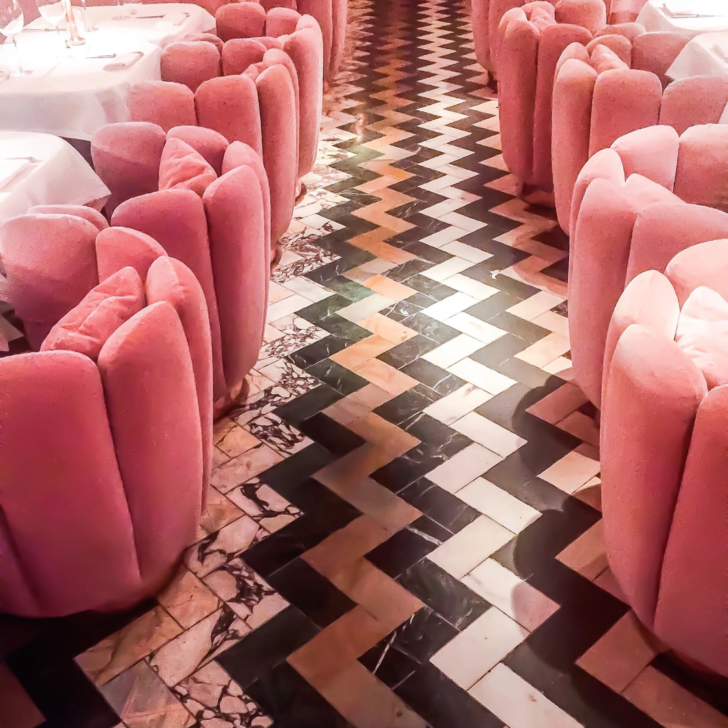
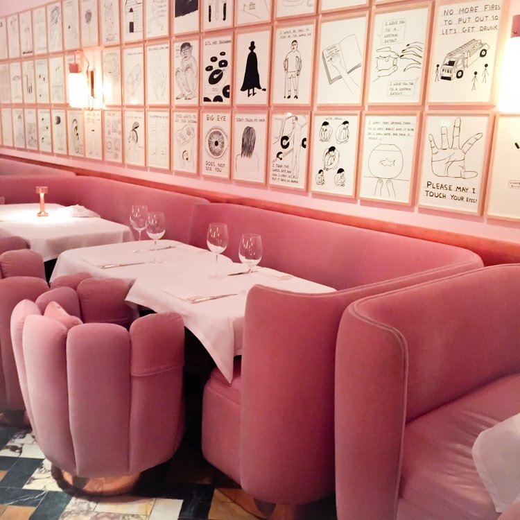
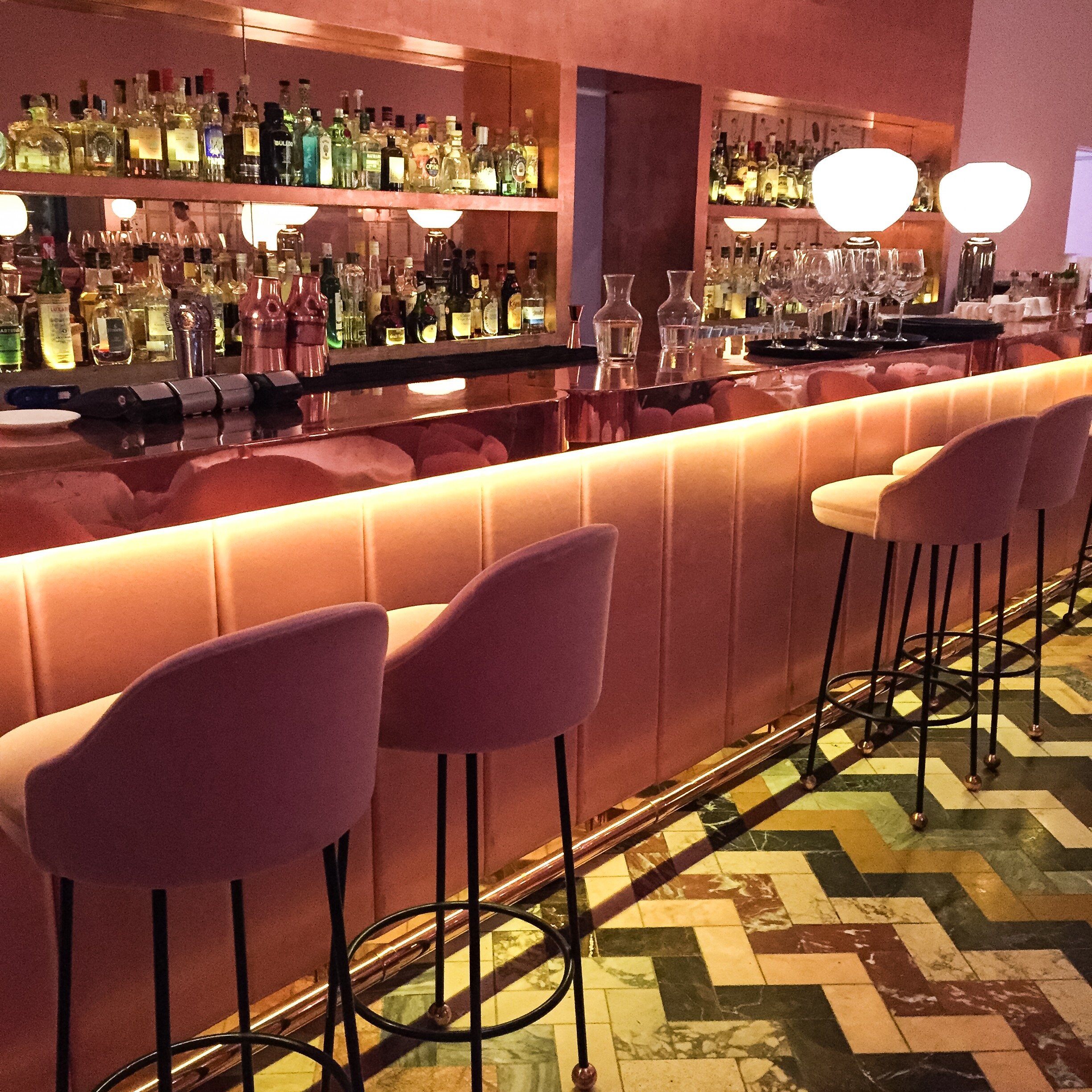
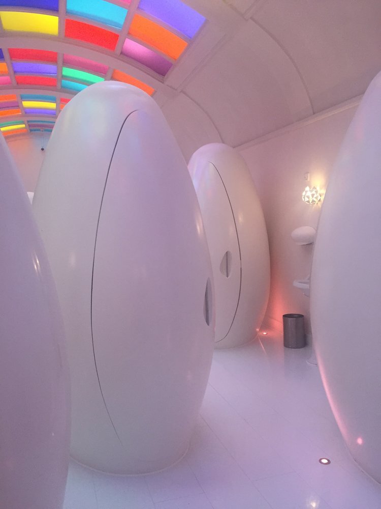
What can we say, this place is just faabulous! One of the most stunning restaurants in London - the interiors are arty, edgy, stimulating, and SUPER-GLAM. It quite possibly is the quirkiest and most ‘grammed restaurant too.
PS: The Afternoon Tea here is to live for!
THE IVY CHELSEA GARDEN, CHELSEA
Here’s where you can experience spring all year round. Perfect for a lazy afternoon, it’s easy, breezy and relaxed. Also great for breakfast or even some delish cocktails.
BERNER’S TAVERN, FITZROVIA
In the mood for a bit of a throwback? Here’s where you can dine in style. Characterised by 19th century interiors with a fresh modern take, this place is totally lush!
London has our heart and TBH there are WAY too many places. There’s Annabel’s, Dalloway Terrace and Circolo Popolare to name a few. And today we’re off to Coppa Club, a place we’ve been dying to go to. Until next time then, from London – with love!
Crushing on Terrazzo
Can we just please tell you how hard we’re crushing on Terrazzo lately? We want to use it everywhere. Terrazzo is ridiculously versatile, it can be used on walls, floors, countertops and even, furniture and accessories.
Can we just please tell you how hard we’re crushing on Terrazzo lately? We want to use it everywhere. Terrazzo is ridiculously versatile, it can be used on walls, floors, countertops and even, furniture and accessories. What we end up with is some major ‘Retro-glam’. Can’t really blame us for being so obsessed, can you?
A little info on the history for the geeks - Terrazzo came about through the inventiveness or sheer boredom in some Venetian stone workers, who were left with oddly shaped pieces of marble after completing their tasks. They put these into clay and flattened the mixture into a comfortable walking surface. Wonder if it was an accident, but they found that goat’s milk was a great sealant; and voila, they had a new, durable, low-cost, low-maintenance flooring! This was back in the day (around the 15th century), and is now making a major come-back, with a modern twist.
It has evolved in terms of style and techniques involved. It comes in bolder, brighter colours and with larger pieces of stone. What used to be an economic option has over time become a luxury material. It is slightly expensive, but the skill and amount of labour involved is very high. Nonetheless, it doesn’t stop us from making big plans with Terrazzo!
PS Travel Diaries: Iceland
PureSpaces traveled to Iceland and you wouldn't guess when! Many would think it’s crazy to travel to a cold country in the dead of winter, but what's life without a punch of experiment.
Caution: Long post ahead!
PureSpaces traveled to Iceland and you wouldn't guess when! Many would think it’s crazy to travel to a cold country in the dead of winter, but what's life without a punch of experiment. So we went on with the plan and don't regret it one bit. It was really cold, but with no snow, it wasn’t anything that you couldn't handle with the right winter gear.
We flew into Reykjavik from Frankfurt one afternoon, all snug and safe, and checked into Hotel Borg. Fixed up in dignified Art Deco interiors, it overlooked the beautiful square of Austurvollur, in the heart of Reykjavik, across from Althingi, the Icelandic Parliament and the cathedral. We couldn’t wait to step out and explore this beautiful country!
Iceland is known for some of the best views of the Aurora Borealis and its spectacular waterfalls. Lesser known is its peculiar folklore - many Icelanders hold these stories of elves, trolls and other hidden beings in high regard. Luckily, we had an enthusiastic and engaging storyteller in our guide Tryygvi. He was our attendant for the entire trip and filled our long rides with such interesting stories about trolls and Vikings, each one more compelling than the other. Icelanders believe that rocks are homes to trolls who live in a parallel universe. There was no way to explain how their attempts to build a road over a rock, failed over and over again. When nothing else worked, they had to build the road around this rock. Such anecdotes are exceedingly fascinating from an outsider's perspective. As amusing as we found them, they had to be put on hold, for our priority was to see the Northern Lights.
Following dinner at Jamie’s Italian in our hotel, Tryygvi drove us 2 hours out of the city to see them. We had assumed it’d be as easy as it would be amazing. But it turned out that the Aurora Borealis can’t be spotted by just looking up at the night sky! We had to drive to a pitch dark spot far from the city lights. This was followed by a long wait in the freezing cold weather, until we saw the lights dancing very faintly. We build high expectations from stunning photographs we have seen or movies we have watched. So seeing something yourself could turn out to be a bit underwhelming. Nonetheless, it was truly beautiful.
The next morning Tryygvi got a jeep with massive tires to take us to Husafell and Langjokull glacier. It was a two-hour drive and we made pit stops at the Krauma geothermal baths, and, The Beauty and the Beast waterfalls on the way. The Godafoss waterfall, or ‘the waterfall of Gods’, is considered one of the most impressive in the country. It is aptly nicknamed beauty by the locals, in comparison to Dettifoss, which is considered the beast. The waterfalls still continued to run, but with some icicles and frost. We had lunch at Husafell, which has incredibly breathtaking, snow-kissed lava fields. The Ice Cave tour was next on our itinerary. People usually hire a monster truck (SIC) that’s better suited to driving on ice and this is what we had done too. But the unduly adventurous Tryggvi managed to get some special permit speaking in Icelandic to the officials and drove us up to Langjokull himself, in a much smaller truck. The word Langjokull translates to the Long glacier, and is the second largest glacier in Iceland. It also houses the largest man-made cave in the world. Walking through the ice tunnels was an incomparable experience, but little did we know then how risky our ride had been. With a visibility of less than a foot, we could hardly see anything around us. We barely managed to follow these sticks along the road to find our way up. It almost felt like we were going backwards. The guides at Into the Glacier we met up there were shocked when they found that we had driven up in a private vehicle during a snowstorm. We wouldn’t have done so, had we known we could have gotten lost or killed! The journey back was slightly better, but we were terrified however, now that we knew what could happen if we strayed off the track. But the experience was still worth all the struggle. It was very windy due to the snow storm and we were surrounded by beautiful, snowy vistas. There was most certainly a very Game-of-Thrones vibe to it. We ended the day with dinner at a fabulous restaurant called FISH MRKT. We highly recommend you eat here if you ever visit Reykjavík.
On day 3, we went on the Golden Circle tour and dog sledding. The famous Golden circle covers the Thingvellir National Park, Geysir hot spring area and Gullfoss waterfall. They drive you from Reykjavik and back, which forms a 300-kilometre circular route. In the morning, we visited the dog kennel. This is extremely fun for a dog-lover, for Iceland is home to a vibrant dog-sledding community. The sleds are pulled on winter snow by Snow Dogs or the adorable Siberian huskies. We were worried about hurting them, but apparently, this was their exercise and they really enjoy it! The duration of the sledding depends on the dogs, people, weather and trail conditions. On an average, they cover 7-8 kilometres in about 45-60 minutes, during which you get to enjoy the power of sled dogs. Afterwards, we were driven to Gullfoss waterfalls and the Geyser geothermal area. Gullfoss was all frozen and looked magnificent. It was no wonder it’s called The Queen of Icelandic Waterfalls. It looked majestic as the icicles dramatically slipped into a deep gorge. On the other hand, the geysirs were erupting at regular intervals, sending boiling water upto 20 metres in the air. They have been dormant for a while now, but the area is still highly active.
Later, we went to Thingvellir National Park, which is one of UNESCO’s world heritage sites, known for its uniqueness as well as its historic significance. Apart from being the site of the ancient parliament of the Viking commonwealth and the birthplace of the nation, it is strewn with breathtaking views of ravines ripped open by earthquakes. An interesting tidbit for you - the stage for many a open-air assemblies, Almannagja gorge, was also the shooting location for the famous HBO series of Game of Thrones.
Our heads full of stunning landscapes, we headed off to explore some charming Christmas decor at night and then to check out Harpa, a modernist, honeycomb concert hall and conference centre. It is one of Reykjavik’s most distinguished landmarks and home to the national opera and symphony. The building features a distinctive coloured glass facade inspired by the basalt landscape of Iceland, and the colours change constantly. Facing the sea, the building almost had a sculptural quality to it. It is an understatement to say that we were exhausted at the end of this long day. We called it a day with a quiet dinner at this really cute place called Ristorante Caruso. It is located in a restored historic building that was initially built in 1801 and their food was out of this world.
The first thing on our itinerary for the last day was a visit to Hallgrimskirkja, a Lutheran parish church in Reykjavik. You are awestruck by this towering structure rising out of the ground into a pointy tip, at almost 75 metres height that can be seen from almost the entire city. Designed by the late architect Gudjon Samuelsson, it took around 41 years to complete the construction. The composition is inspired by the local basalt rock formations as well as Iceland’s glaciers and sweeping landscapes. The country did not have its own style of architecture apparently, for the longest time. It had always been a medley of different historical styles in confluence with foreign influences. Recent times have brought about change in terms of newer architects and weather-appropriate materials being put to use, that gives character to the present Icelandic cityscape.
We had saved the best for last - and headed to the Blue Lagoon after Hallgrimskirkja. The drive here was scattered with BEAUTIFUL sights all along that we had to stop often and enjoy them at leisure. The best of our pit-stops was at this active crater and we climbed up on to billowing steam. We soon arrived and checked into The Retreat Hotel. Nestled amongst volcanic horizons and panoramic vistas of mossy mountains, it was like we had walked into a paradise of relaxation and luxury. With the designer’s radar always turned on, one of the first things we noticed that ALL the furniture in here was Minotti (which is one of PureSpaces’ favourite brands).
It was a surreal experience waking up to the beautiful views of moss-covered lava fields and volcanic mountainscapes. One would think nothing could beat this, then came their excellent food. And as a cherry on top, we tried their in-water massage and it turned out to be an exceptional experience. It was an indulgent massage elevated by the revitalizing geothermal seawater against a jaw-droppingly stunning backdrop. It seemed to unlock sublime levels of well-being in you. We also got the complementary Blue Lagoon ritual that came highly recommended. It was a combo of lava scrub, silica mud mask and algae mask. It would suffice to say that we were in heaven. And who could possibly not want to go back after being spoilt rotten like this?! On a different note, PureSpaces also gives the Blue Lagoon skin care their seal of approval!
Iceland, all things considered, had charmed us in many ways. It was a unique experience in winter, where you need to pack a whole lot into really short days of around 5 hours of daylight. But this winter wonderland was calm, quiet and less crowded, which was something we really savoured. We had had some amazing food, always fresh and very expensive. Here goes another Tryggvi trivia - the food in Iceland is rather expensive owing to the fact that they need to be grown in greenhouses. How different and exotic life is, just a few hours away from our homes! Travelling gives us so much food for thought. Like all travellers, we had done so much in so little time, and had our share of ups and downs. But there isn’t a thing we would change about it, (except for, maybe, going up to the glacier in a safer vehicle). Kudos to Iceland as a great vacay spot, even at the peak of winter!
What’s on TV?
It goes without saying that all shows we recommend here are related to interior spaces.
Forget binge-watching Game of Thrones and Black Mirror we’ve got a bunch of other outstanding Netflix shows lined up for you. It goes without saying that all shows we recommend here are related to interior spaces. Not only are these shows hugely entertaining they’re inspiring, transformative, engaging and emotional. Each of them in their own way could trigger a sense of growth and yet they’re fun to watch. Here goes our list -
QUEER EYE
So, we’d like to start off with Queer Eye, which undoubtedly tops our chart. The 5 gay professionals, or the Fab-Five as they are called, come in and transform the lives of people stuck in a rut. Like magic, they make their way into someone’s lifestyle, fashion, food, interior space and emotional life, and leave a brand new person in their wake, ready to take on the world. What it does for the viewer is not entirely different - we are left awe-struck by the magnitude of what’s possible for us too! The show is a spin off of an old series - “ Queer Eye for the Straight Guy ” starring a different cast in 2003. Over a decade later, we have the new series which amidst all the glamour, throws in a good dose of conversations about social concerns. There are intense emotional interactions which unmask their vulnerability and leave us reaching out for tissues. Altogether, every episode leaves a mark on us with their beautiful story-telling and their incredible impact on people’s lives.
ABSTRACT: ILSE CRAWFORD
We can never have enough role models who inspire us and spark our imagination; and we found a spectacular one in Ilse Crawford, in the episode featuring her in Abstract on Netflix. She started out her career in times when interior design was all about pomp and theatricality. But she made such a great impact with her unique attitude that she stood out from the crowd with effortless grace. Design, for her, is a ‘frame for life’ and the tangible senses are what guide her subtle style. This makes the pivotal theme for her book The Sensual Home as well. We could absolutely relate to her style in Ett Hem , a century-old home that Ilse converted into a boutique hotel. It is like the epitome of her design philosophy – there is a sense of tranquility woven through the space with its cozy furniture, muted color tones and earthy textures. Her design outlook and aesthetic is contagious, and leaves one nothing but inspired. All you wish is you could do it with her ease and poise.
STAY HERE
This is a space make-over show, similar to Queer Eye. If the Fab-Five transformed spaces for personal use, the Stay Here team works wonders for businesses, but with a personal touch. Designer Genevieve Gorder and real estate expert Peter Lorimer come together to help clueless homeowners transform their holiday homes into havens for a diverse group of travelers. They push the boundaries of design in challenging situations to come up with practical and innovative, yet simple solutions; while not losing focus on the primary goal of revenue generation. The trendy spaces and their tremendous success leave the viewers very impressed.
TIDYING UP WITH MARIE KONDO
Here we have on the show a unique personality who truly transforms homes. Some would say, the Queen of Clean! Ironically, she is this petite, happy woman with a halo of tranquility, who wreaks havoc in homes that she walks into before working her charm. The families go through a journey of retaining things that spark joy and parting with memories that don’t, which is often very difficult. But Marie makes tidying up look as easy as it’s not. In the end, they are thrilled with the overall outcome. And the viewers are left wishing for a swish of her wand in their own homes.
And we’re done! Our list does involve a lot of design and cleaning up but it’s a short one. We promise it'll be worth your while, and if you do decide to give the make-over a go, that’ll be worth it too!
Story of The Wall
Quite evidently we love change, and what’s wrong with that?!
If you walked into our office a year ago you’d have found our Pantone wall right at the entrance. Krishna and Kamini had put it up, card by card, at the inception of PSHQ in 2016, along with Team A&J who shared the office space with us back in the day. Then again, if you were here 6 months ago, you’d see a vibrant tropical wall mural. Pink hibiscus peeping out from behind lush green leaves, hand painted by artists from our very own Artifold. Now here we are, not too far into 2019, with our Dusty Pink Board and Batten Wall. Quite evidently we love change, and what’s wrong with that?!
You might wonder how we arrived at this sophisticated feature wall from our quixotic garden mural. We’ve always loved the Classical British Style of Interiors and wall moulding is an intrinsic feature of this style that offers endless possibilities in decorating a wall. Although it had a functional origin, over the centuries it’s journeyed from its ornate past to the simpler designs we see today. We narrowed down on the Board and Batten design which perfectly fits into a contemporary set up and works well with our aesthetic.
We were ready to begin our newest little project. The mural was scraped off and the wall prepped for its brand-new cladding. The placement of battens involved a fair bit of math. We sampled a few squares to see what worked best visually. While the boards and battens were up on the wall in the blink of an eye, choosing between Summer Pink and Desert Rose wasn’t as easy as we’d imagined. We finally managed to select one and the wall was ‘duco-ed’. Turns out, we were nowhere near done with our fascination for the tropical! It made its way back into the artwork and looks so much the better for it.
With the redesigned accent wall our office looks absolutely groovy. Wall moulding is the go-to design detail for classical addicts. It is so versatile that it can make a space look modern and minimal or even vintage and grand. These designs have come alive in a contemporary form at a law office we recently designed. The mouldings are painted in a stately grey and neutral white, and reflects the power and tension involved in their profession. It’s a feature that we have used consciously on wall panels, cabinet shutters and doors with a view to tie the whole space together holistically. Contrary to the austerity we’ve orchestrated here, the wall decor taking shape in our upcoming classical villa is all splendour and extravagance. But no matter the style, we always get stunning results. Needless to say, we’re gonna be using it a lot! Because we know this is a trend that’s here to stay.


